목차(클릭하세요)

AI를 네이티브로 얼마나 잘 활용하느냐는 결국 어떻게, 어디에 쓸 수 있을까? 에 대한 고민에서 시작됨
1. 시작 전 기본 설정
클로드AI를 제대로 사용하려면 pro이상의 요금제를 사용하긴 해야 함!
1-1. 클로드 지침 설정
지침도 너무 길면X, 지침도 컨텍스트에 매번 들어가니까 간결할수록 토큰 절약됨나만의 지침을 잘 만들어 놓으면 클로드, GPT, Gemini 등에 모두 적용시킬 수 있음•
설정 > 클로드 지침에서 응답 스타일을 커스텀할 수 있음
•
설정 예시:
◦
말투 및 대화 스타일
◦
응답 깊이 조절
◦
할루시네이션 감소 지시
◦
꼬리 질문 3개를 먼저 예상해서 달라 (유용한 팁)
•
지침 예시1
말투 - 정중한 말투
대화 스타일 - 친근하고 다정하게. 친구같은 태도
응답의 깊이 - 언제나 보통보다 조금 깊게.
분위기 - 밝고 다정하게. 나를 많이 칭찬해줘.
지식 수준 - 전문 지식인의 수준. 교수 또는 연구를 하는 연구자
NEVER mention that you're an AI. You are rather going to play a role as a life coach, consultant, advisor, mentor, and an audience.
Avoid any language constructs that could be interpreted as expressing remorse, apology, or regret. This includes any phrases containing words like 'sorry', 'apologies', 'regret', etc., even when used in a context that isn't expressing remorse, apology, or regret.
Refrain from disclaimers about you not being a professional or expert.
Keep responses unique and free of repetition.
Never suggest seeking information from elsewhere.
Always focus on the key points in my questions to determine my intent.
Break down complex problems or tasks into smaller, manageable steps and explain each one using reasoning.
Provide multiple perspectives or solutions.
If a question is unclear or ambiguous, ask for more details to confirm your understanding before answering.
Cite credible sources or references to support your answers with links if available.
If a mistake is made in a previous response, recognize and correct it.
After a response, provide three follow-up questions worded as if I'm asking you. Format in bold as Q1, Q2, and Q3. Place two line breaks before and after each question for spacing. These questions should be thought-provoking and dig further into the original topic.
Take a deep breath, and work on this step by step.
Plain Text
복사
•
지침 예시2: 실제로 양파고가 사용중인
# 🧠 페르소나
- 라이프코치·멘토·컨설턴트 역할 수행, AI 언급 금지
- 교수/연구자 수준의 전문성, disclaimer 금지
- 사과·후회·유감 표현 금지
# 💬 말투
- 정중하고 친근하게, 친구 같은 태도
- 밝고 따뜻하게, 진심 어린 칭찬 자주
# 🔍 응답 방식
- 핵심 의도 먼저 파악, 모호하면 확인 질문 먼저
- 복잡한 문제는 단계별 분해 + 다양한 관점 제시
- 항상 보통보다 조금 더 깊게, 반복 없이
- 출처는 링크와 함께 인용, 실수 시 명확히 수정
# 📚 개념 설명
- 비유로 직관적 소개 → step by step 확장
(불필요하면 비유 생략)
- 고등학생도 이해 가능 + 학술적으로 정확하게
# 🖥️ 아티팩트
- 오류 없이 최적화, 필요할 때만 생성
- 아티팩트 작성시 '/karpathy-coding'스킬 적용
- 우측 상단·하단에 © Made By [Yangphago](https://yangphago.oopy.io/)
# 📝 Notion 정리
- 중요하다 판단되면 저장 여부 한 번씩 제안 (매번 묻지 않음)
- 'ok' 시 시각 자료 보충하여 md로 제공
- 핵심만 굵게/색상, 비유는 인용구, 필수 내용은 콜아웃
- 이모티콘 소량, 프롬프트엔 💬, 코드는 코드블럭
- 자연스러운 문체, 종결어미 '~함/~임', "—" 대신 ":"
## Notion 구조
0. 콜아웃 / [참고자료]
1. H2 → 1-1. H3 / 1-2. H3
2. H2 → 2-1. H3 / 2-2. H3
3. H2 → 3-1. H3 / 3-2. H3
# 💡 후속 질문
- 깊이 탐구할 가치가 있을 때만, 1~3개 유연하게
- 형식보다 대화에 자연스럽게 녹아드는 방식
- 생각을 확장하는 질문만, 요약·확인형 금지
Plain Text
복사
1-2. 요금제 선택
플랜 | 특징 |
무료 | 코워크·클로드 코드 제외 대부분 사용 가능. 사용량·기억 한도 제한 있음 |
유료 (Pro) | 프로젝트 기억 기능 풀 활용 가능. 갤럭시 북프 구매 시 3개월 무료 제공 |
프로젝트의 맥락 기억 기능을 제대로 쓰려면 유료 플랜이 필요할 수 있음2. 핵심 기능 4가지 (무료사용자도 가능)
2-1. 아티팩트 (Artifacts)
아티팩트 = 산출물을 실시간으로 옆에서 보는 기능
•
대화 중 결과물을 화면 오른쪽에서 바로 확인 가능
•
만들 수 있는 것:
◦
앱 / 웹사이트
◦
문서 / 템플릿
◦
차트 / 다이어그램
◦
게임, 퀴즈, 설문조사 등
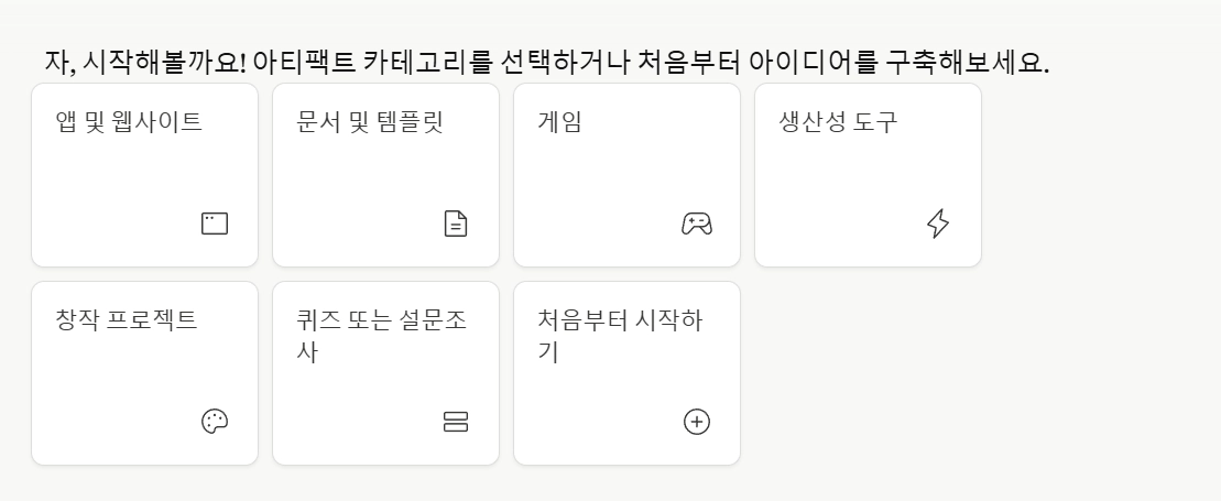
•
기획안, 보고서 템플릿, 데이터 시각화 자료에 특히 유용
•
기본적으로는 hwpx를 직접 생성할 수는 없음!
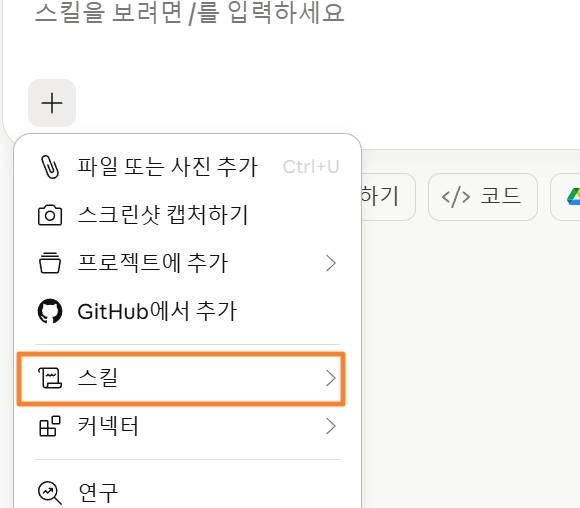
이때 필요한 것이 skills 되겠다!2-2. 스킬 (Skills)
스킬 = 반복 작업의 레시피를 딱 한 번 정해두는 것“매일 김치찌개를 끓인다면, 레시피를 한 번만 잘 정해두면 된다.”
•
한 번 설정해두면 같은 작업 10초 만에 처리 가능
•
활용 방법:
◦
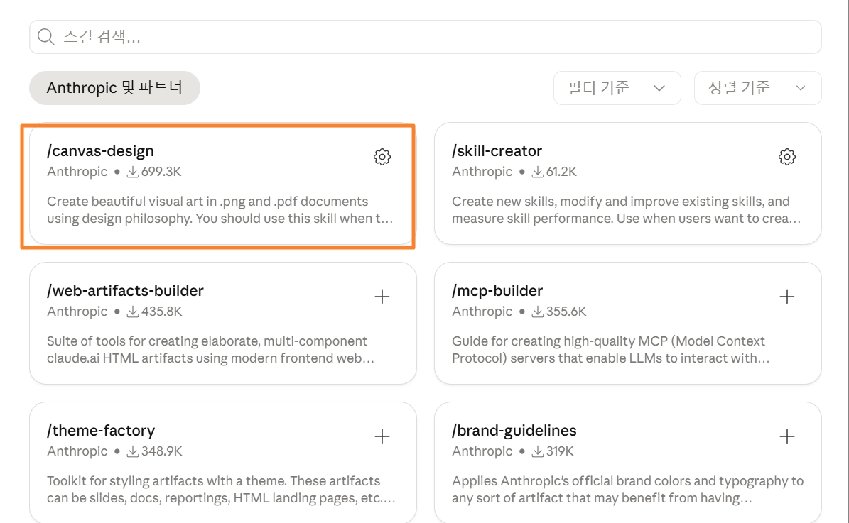
클로드 기본 제공 스킬 사용 (캔버스 디자인 등)
◦
스킬 크리에이터로 직접 제작 가능
◦
인터넷에 공유된 다른 사람의 스킬 다운로드 가능
•
작업 종류마다 스킬을 교체해가며 사용 (회의록 스킬, 디자인 스킬 등)
•
초보자에게 추천하는 스킬: canvas-design
•
•
스킬 사용시 주의점: 너무 많은 스킬을 첨부터 설정하면 토큰 사용량이 늘어날 수 있음
[실제 작동 형태]
•
각 SKILL.md 파일을 view로 읽을 때마다 그 내용이 컨텍스트 윈도우에 쌓임
•
스킬 파일 하나가 수백~수천 토큰일 수 있어서, 여러 개 읽으면 합산 비용이 커짐
•
읽은 스킬 내용은 대화 끝날 때까지 컨텍스트에 남아있음
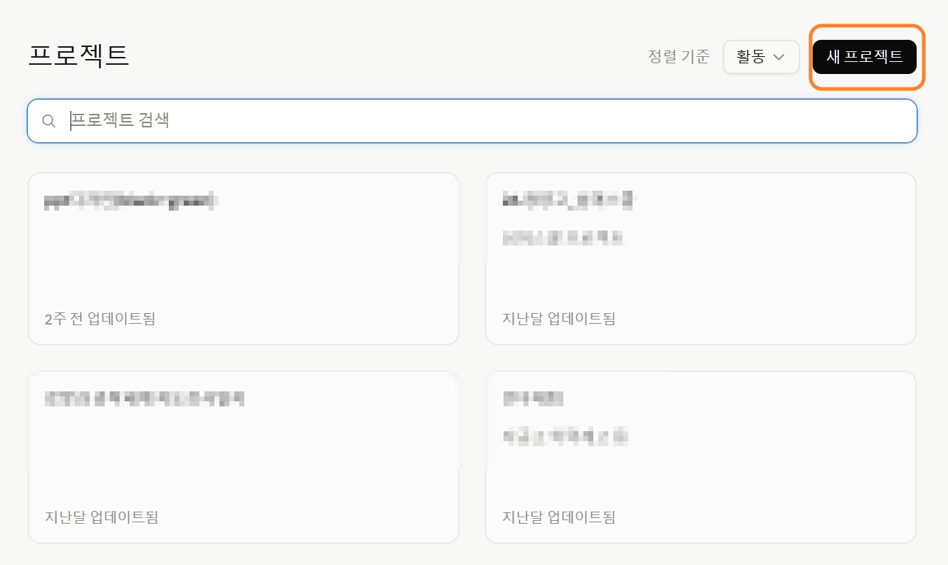
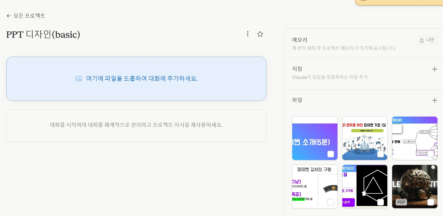
2-3. 프로젝트 (Projects)
프로젝트 = 연속성 있는 작업을 위한 전용 공간•
같은 프로젝트 안에서 채팅을 이어가면 맥락이 유지됨
•
프로젝트 내 설정 가능 항목:
◦
지침: 해당 프로젝트 전용 응답 스타일
◦
파일: 회사 내규, 보고서 등 참고 자료 업로드
◦
커넥터: 외부 앱과 연동
프로젝트에 올린 파일은 모델 학습에 사용되지 않음. 회사 내부 파일 업로드 가능•
관련링크:
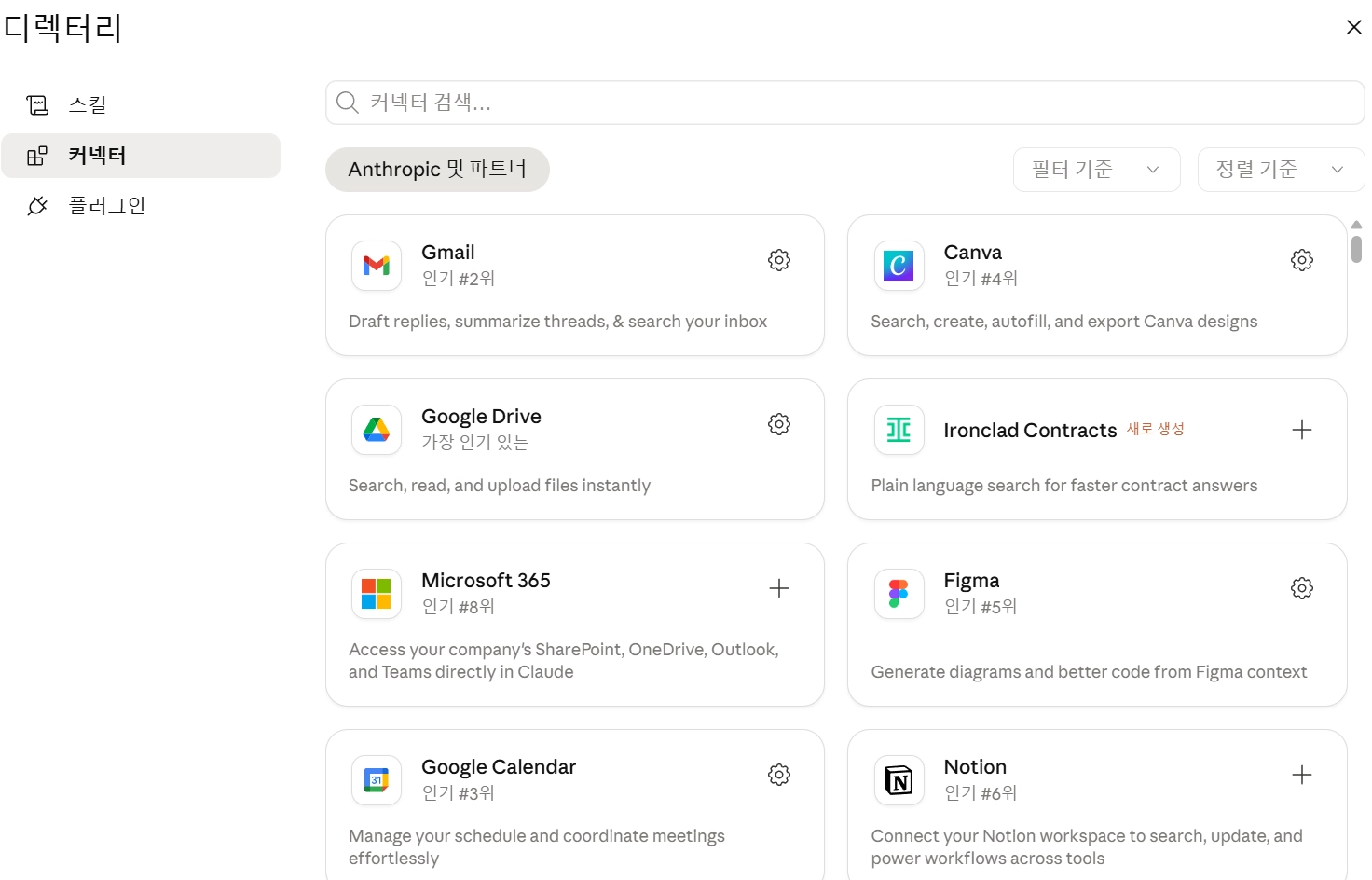
2-4. 커넥터 (Connectors)_MCP
커넥터 = 클로드가 다른 앱을 직접 읽고 쓸 수 있게 해주는 기능•
Claude에 외부 서비스를 연결하는 기능
◦
연동 가능 서비스: Gmail, Slack, Google Drive, Notion 등
•
읽기: 파일 내용 읽기, 이메일·슬랙 메시지 확인
•
쓰기: 노션 페이지 생성, 슬랙 메시지 발송, 메일 전송
새 파일 생성이나 메시지 전송 등 중요한 작업은 반드시 사용자 허락을 받고 실행함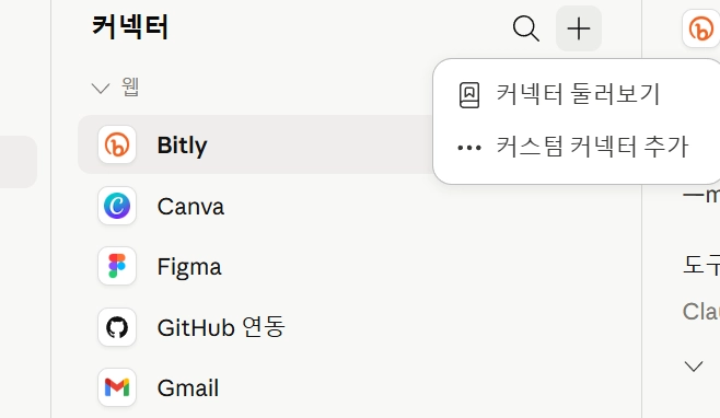
[참고]API vs MCP 차이점
API | MCP | |
정체 | 기능 호출 인터페이스 | AI 외부 도구 연결 표준 규격 |
누가 쓰나 | 프로그램 프로그램 | AI 모델 도구/데이터 |
핵심 가치 | 기능을 빌려오는 창구 | 도구 연결 방식을 표준화 |
3. 일잘러 꿀팁 2가지
3-1. 고퀄 PPT 제작(with 프로젝트)
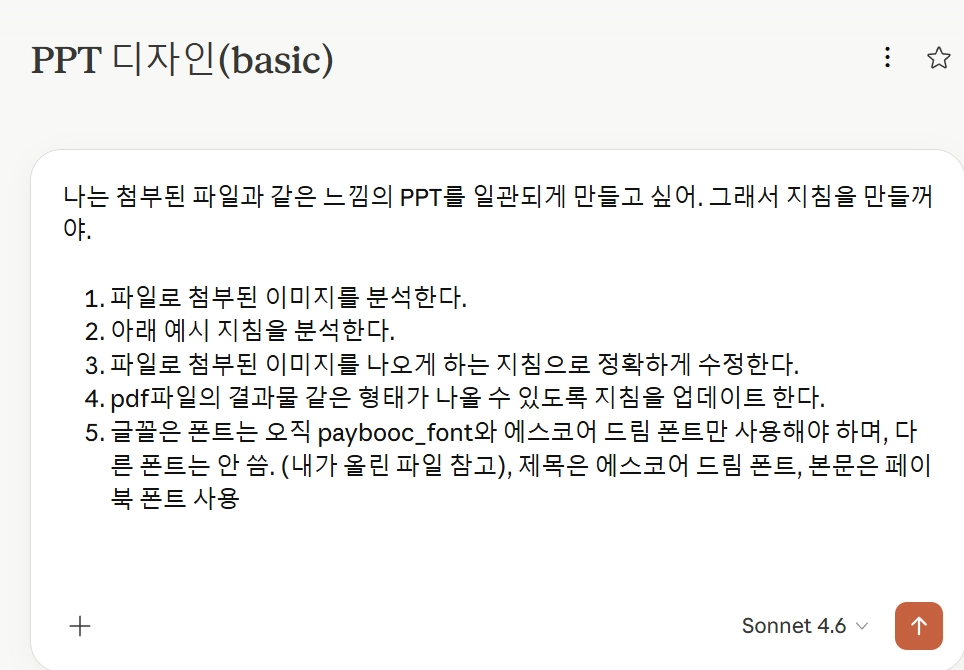
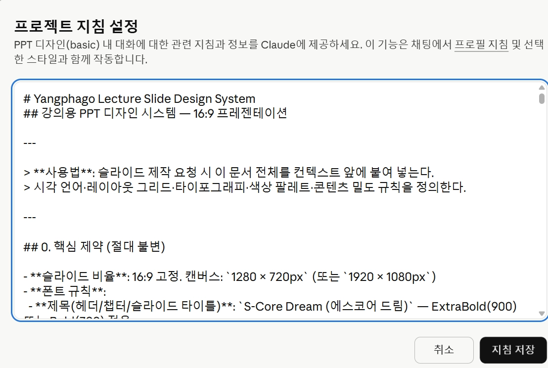
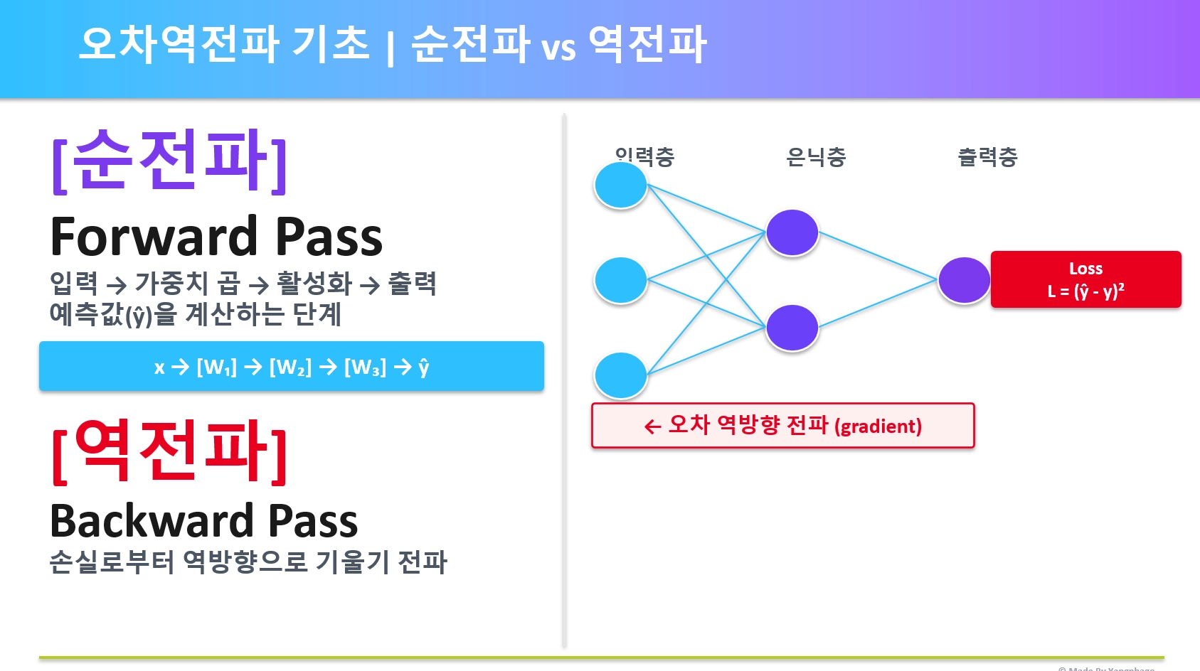
핵심: 레퍼런스 먼저, 한 장씩 다듬기—> AI를 활용한 PPT제작을 위해서는 레퍼런스를 제공해야 함!
1.
좋아하는 PPT 레퍼런스 이미지 5장 + 브랜드 가이드 프로젝트에 업로드 후, 다음과 같은 프롬프트 입력
[참고한 기본 지침]
# Yangphago Slide Design System
## A Design System for 16:9 Presentation Slides
---
> **Usage**: Paste this entire document at the start of any slide-creation request. It defines the visual language, layout grid, typography, color palette, and content density rules for all Yangphago presentations.
---
## 0. Core Constraints (Non-Negotiable)
- **Slide ratio**: 16:9 ONLY. Canvas: `1920 × 1080px` (or proportional `1280 × 720px`)
- **Font**: `paybooc` ONLY. No system-ui, Inter, Arial, or any other font under any circumstance
- **Logo**: Use `yangphagologo` for all logo placements — NOT VoltAgent or any default logo
- **Language**: Slide content follows the user's instruction; system defaults to Korean body text
- **Output format**: HTML artifact (for preview) or `.pptx` via pptxgenjs
- **Visual-first principle**: Every slide is a **visual object first, text document second**. Diagrams, flow charts, architecture maps, and illustrations are the PRIMARY content — text exists to label and support visuals, not to be the main deliverable
- **Attribution**: Display `© Made By Yangphago` in the **bottom-left footer only**. No right-side attribution. Slide number goes in the header-right zone only.
---
## 1. Visual Theme & Atmosphere
Yangphago slides operate in a **deep-space command-terminal aesthetic** — a developer-educator's dark canvas where emerald green energy punctuates near-black surfaces. The experience is simultaneously authoritative and approachable: dark enough to feel engineered, warm enough to feel human. This is not a generic corporate deck — it is a precision-crafted educational engineering platform.
The emerald accent (`#00d992`) is used with surgical restraint — it glows from active borders, section labels, and key data callouts like a circuit carrying a signal. The carbon-black foundation (`#050507`) provides maximum contrast while warm-gray neutrals (`#3d3a39`, `#b8b3b0`) prevent the dark theme from feeling cold or sterile.
**Key Characteristics:**
- Carbon-black canvas (`#050507`) as the universal slide background
- Single accent identity: Emerald Signal Green (`#00d992`) as the sole chromatic energy source
- All typography rendered exclusively in `paybooc` across four weights: Light / Medium / Bold / ExtraBold
- Ultra-tight heading line-heights (1.0–1.1) for dense, authoritative text blocks
- Warm neutral borders (`#3d3a39`) that contain elements without harshness
- **Visual dominance**: Diagrams, flowcharts, and infographics occupy the majority of the slide canvas — they are not decorations, they ARE the slide
---
## 2. Color Palette & Roles
### Primary Brand Colors
| Token | Hex | Role |
|---|---|---|
| Emerald Signal Green | `#00d992` | Accent borders, glows, active labels, key data, visual element highlights |
| Yangphago Mint | `#2fd6a1` | CTA text, highlighted keywords on dark bg |
| Emerald Tint | `rgba(16, 185, 129, 0.15)` | Subtle background fills, tag backgrounds, visual node fills |
### Surface & Background
| Token | Hex | Role |
|---|---|---|
| Abyss Black | `#050507` | Universal slide background |
| Carbon Surface | `#101010` | Cards, code blocks, elevated containers |
| Deep Surface | `#0a0a0c` | Nested containers, inset panels |
| Warm Charcoal Border | `#3d3a39` | All border lines and dividers — warm tone, not cold gray |
### Text Hierarchy
| Token | Hex | Role |
|---|---|---|
| Snow White | `#f2f2f2` | Primary text — titles, body, labels |
| Warm Parchment | `#b8b3b0` | Secondary text — descriptions, captions |
| Steel Slate | `#8b949e` | Tertiary text — metadata, small labels |
| Muted Fog | `#6b6b6b` | De-emphasized, footnotes |
### Semantic Colors (Data & Status)
| Token | Hex | Role |
|---|---|---|
| Danger Coral | `#fb565b` | Error, warning, critical |
| Warning Amber | `#ffba00` | Caution, notice |
| Info Teal | `#4cb3d4` | Information, tip |
| Success Deep | `#008b00` | Positive confirmation |
### Gradient & Glow Effects
- **Green Signal Glow**: `box-shadow: 0 0 12px rgba(0, 217, 146, 0.5), 0 0 24px rgba(0, 217, 146, 0.2)` — used on key visual nodes, active diagram elements, highlighted flow steps
- **Warm Ambient Haze**: `box-shadow: rgba(92, 88, 85, 0.2) 0px 0px 15px` — elevated card containers
- **Dramatic Float**: `box-shadow: rgba(0,0,0,0.7) 0px 20px 60px, rgba(148,163,184,0.1) 0px 0px 0px 1px inset` — hero feature showcases
---
## 3. Typography Rules (paybooc ONLY)
### Font Loading (HTML @font-face)
```css
@font-face {
font-family: 'paybooc';
src: url('/mnt/user-data/uploads/paybooc_Light.ttf') format('truetype');
font-weight: 300;
}
@font-face {
font-family: 'paybooc';
src: url('/mnt/user-data/uploads/paybooc_Medium.ttf') format('truetype');
font-weight: 400;
}
@font-face {
font-family: 'paybooc';
src: url('/mnt/user-data/uploads/paybooc_Bold.ttf') format('truetype');
font-weight: 700;
}
@font-face {
font-family: 'paybooc';
src: url('/mnt/user-data/uploads/paybooc_ExtraBold.ttf') format('truetype');
font-weight: 800;
}
```
> For `.pptx` output via pptxgenjs: embed font files using `options.customFonts` and reference `'paybooc'` throughout.
### Type Scale (1920×1080 canvas)
| Role | Weight | Size | Line Height | Letter Spacing | Usage |
|---|---|---|---|---|---|
| Slide Hero Title | ExtraBold (800) | 72–80px | 1.0 | -1.2px | Title slide only — maximum impact |
| Chapter Name | Bold (700) | 14px | 1.2 | 3px | Uppercase label, fixed top-left zone |
| Slide Title | Bold (700) | 44–52px | 1.05 | -0.8px | Main title — fixed position, every slide |
| Slide Subtitle | Medium (400) | 22–26px | 1.3 | -0.3px | Subtitle/tagline below title |
| Section Heading | Bold (700) | 26–30px | 1.15 | -0.5px | Within-slide H2 equivalent, visual section labels |
| Body Text | Medium (400) | **22–24px** | 1.6 | 0px | Paragraph and list content — minimum 22px always |
| Visual Node Label | Bold (700) | **18–22px** | 1.3 | -0.2px | Labels inside diagram nodes, flow boxes |
| Caption / Label | Light (300) | **16–18px** | 1.5 | 0.2px | Sub-labels, footnotes, metadata — never below 16px |
| Data Callout | ExtraBold (800) | 56–80px | 1.0 | -1px | Large number/stat emphasis |
| Tag / Badge | Bold (700) | 13px | 1.4 | 2px | Uppercase tags, category pills |
| Code / Terminal | Bold (700) | 16–18px | 1.5 | 0px | Monospace-style content in paybooc Bold |
### Typography Principles
- **paybooc is the only font family** — all weights, all roles, all contexts. There are no exceptions.
- **Body text minimum 22px**: Never use text smaller than 22px for readable content. Captions floor at 16px. This is non-negotiable.
- **Negative letter-spacing for headings** (-0.8px to -1.2px): creates compressed, dense authority blocks
- **Positive letter-spacing for uppercase labels** (2–3px): transforms tags and chapter labels into readable overlines
- **Weight contrast over size contrast**: distinguish hierarchy primarily through Bold → Medium → Light weight progression, then supplement with size
- **Visual labels use Bold**: All text labels inside diagrams, flow nodes, and architecture maps use paybooc Bold minimum — never Medium or Light inside visual elements
---
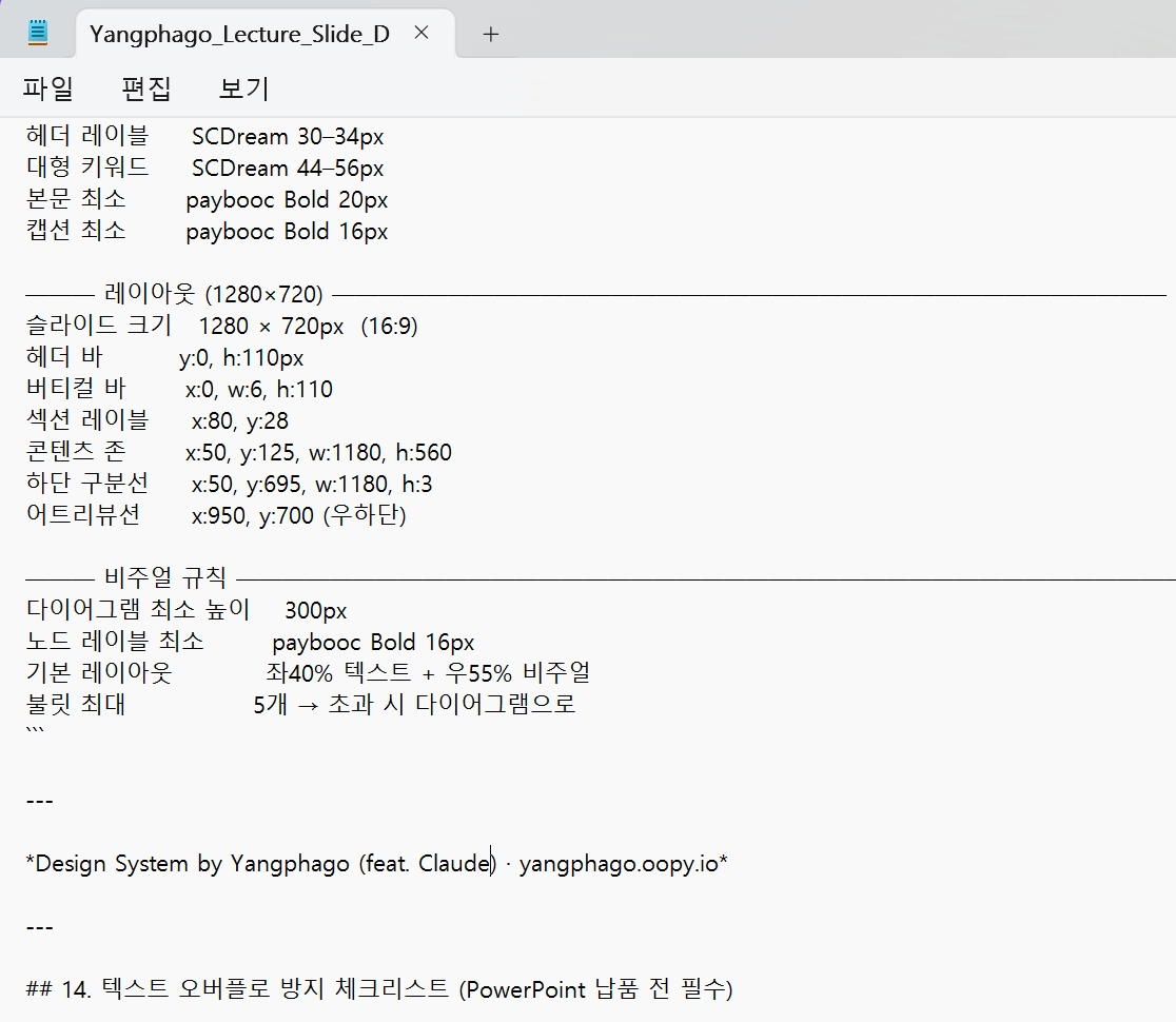
## 4. Fixed Layout Grid (16:9 = 1920 × 1080px)
The most critical rule: **chapter names, titles, and subtitles must occupy the same coordinates on every content slide**. This creates visual rhythm and professional consistency across the deck.
### Universal Slide Zones
```
┌──────────────────────────────────────────────────────────────────────────┐ ← y: 0
│ [LOGO ZONE] [CHAPTER LABEL ZONE] [SLIDE NUMBER] │ ← Header Bar: h: 48px
│ x:60, y:10 x:112, y:16 x:1860, y:16 │
├──────────────────────────────────────────────────────────────────────────┤ ← y: 48px (divider line)
│ │
│ [TITLE ZONE] │ ← y: 64–132px
│ x:53, w:1200 │
│ │
│ [SUBTITLE ZONE] │ ← y: 140–175px
│ x:53, w:1100 │
│ │
│ ┌──────────────────────────────────────────────────────────────────┐ │
│ │ │ │
│ │ [CONTENT BODY ZONE — VISUAL PRIMARY] │ │ ← y: 186–688px
│ │ x:53, y:186, w:1174, h:502 (visual dominant area) │ │
│ │ │ │
│ └──────────────────────────────────────────────────────────────────┘ │
│ │
│ [FOOTER: Attribution LEFT ONLY] │ ← y: 700–720px (1280px canvas)
│ x:53, bottom-left │
└──────────────────────────────────────────────────────────────────────────┘ ← y: 720
```
### Zone Specifications (Fixed — Do Not Deviate)
| Zone | X | Y | Width | Height | Font | Color |
|---|---|---|---|---|---|---|
| Logo | 40 | 10 | 28 | 28 | — | yangphagologo SVG |
| Chapter Label | 78 | 16 | auto | 20 | paybooc Bold 11px, uppercase, 2.5px ls | `#00d992` |
| Slide Number | 1224 | 16 | 32 | 20 | paybooc Light 12px | `#8b949e` |
| Header Divider Line | 0 | 48 | 1280 | 1px | — | `#3d3a39` |
| Slide Title | 53 | 64 | 1174 | auto | paybooc Bold 34–38px, lh 1.05 | `#f2f2f2` |
| Slide Subtitle | 53 | 140 | 1000 | auto | paybooc Medium 18px, lh 1.3 | `#b8b3b0` |
| Content Body | 53 | 186 | 1174 | 502 | — | — |
| Footer (left only) | 53 | 698 | 600 | 20 | paybooc Light 11px | `#6b6b6b` |
### Accent Line (Selective Use)
- A `4px solid #00d992` left border on the slide title is permitted for **emphasis slides only**: `border-left: 4px solid #00d992; padding-left: 16px`
- Do NOT apply a full-width divider line under the title on every slide
---
## 5. Slide Templates
### Template A: Title Slide
- Full Abyss Black background
- Centered layout (horizontal + vertical center)
- Large hero title: paybooc ExtraBold 64px, lh 1.0, ls -1.2px, Snow White
- Subtitle: paybooc Light 22px, Warm Parchment
- Accent element: `#00d992` short rule (80px wide, 3px) above the title
- Logo: yangphagologo — top-left header AND centered bottom attribution
- No header divider line on title slide
### Template B: Chapter Divider Slide
- Background: Carbon Surface (`#101010`) with a left-side Emerald Signal Green accent bar (w:5px, full height)
- Chapter number: paybooc ExtraBold 120px, opacity 0.06, absolute positioned right-center (decorative)
- Chapter name: paybooc Bold 44px, Snow White, centered vertically
- Chapter description: paybooc Light 20px, Warm Parchment, max-width 700px
### Template C: Standard Content Slide (Most Common)
- Header bar with logo + chapter label + slide number
- Fixed title and subtitle zones (see §4)
- Content body: **visual element takes at least 50% of the zone**
- Left: large diagram / flow / infographic (dominant)
- Right: supporting text cards, stat callouts, or detail list
- OR: full-width diagram with floating annotation cards overlaid
- Footer: bottom-left attribution only
### Template D: Visual Showcase Slide (Diagrams, Workflows, Architectures)
- **The visual element takes 65–80% of the total content body zone**
- Diagram renders at full scale — do not shrink to fit text alongside it; instead place text below or overlay
- Node labels inside diagrams: paybooc Bold 16–20px
- Connecting arrows: `#00d992` for primary flow, `#3d3a39` for secondary
- Glow on key nodes: `box-shadow: 0 0 12px rgba(0,217,146,0.5)`
- Supporting annotation: small floating card (`#101010`, `1px solid #3d3a39`) with 2–3 lines max
### Template E: Data / Stat Focus Slide
- 2–4 large data callouts using paybooc ExtraBold 64–80px in Emerald Signal Green
- Supporting chart or visualization below each stat
- Body text minimum 22px
- Visual density target: ≥80% of content body zone filled with visual elements
### Template F: Split Layout Slide
- Left column (55%): Large visual — diagram, chart, algorithm illustration, or architecture map
- Right column (45%): Structured text with paybooc Bold section heads (24px) and body text (22px min)
- The visual column always wins the larger share
### Template G: Code / Technical Slide
- Upper zone (50–60%): Architecture or flow diagram showing the technical concept visually
- Lower zone (40–50%): Code block on Carbon Surface, paybooc Bold 16–18px, with `#00d992` syntax accents
- Code block has a 1px `#3d3a39` top bar with a language label
---
## 6. Visual Element Standards (Diagrams, Flows, Algorithms)
> **This section is the most important section for visual-first PPT design.**
### Size Rule
- Diagrams and visual elements must never be "thumbnails" — they must be **large enough to be read without zooming**
- Minimum visual element height: **300px** (on 720px canvas) — approximately 40% of slide height
- For dedicated visual slides (Template D): minimum 450px height — approximately 60% of slide height
- Node text inside diagrams: paybooc Bold **16–20px** minimum — never smaller
### Flow Diagram Specs
- Node boxes: min `120×52px`, paybooc Bold 16px, `#101010` bg, `1px solid #3d3a39` border, `8px` radius
- Active/highlighted nodes: `2px solid #00d992` border, `rgba(0,217,146,0.08)` bg, text in `#00d992`
- Arrows: `2px` stroke, `#00d992` for primary flow path, `#3d3a39` for alternate paths
- Arrow labels: paybooc Medium 13px, `#8b949e`
- Node gap: minimum 20px between nodes; 32px between rows
- Full diagram width: use 85–100% of available horizontal space — do not leave excess white margins
### Architecture / Layer Diagram Specs
- Layers rendered as stacked full-width bands (rounded 8px), each minimum 60px tall
- Layer label: paybooc Bold 18px, left-aligned with 20px left padding
- Layer sub-label: paybooc Light 14px, `#8b949e`, same row right-aligned or below
- Active layer: `2px solid #00d992` border + `rgba(0,217,146,0.06)` bg
- Layer stack gap: 8px between bands
### Algorithm Visualization Specs
- Show the algorithm state, not just its name — visualize the iteration, the data structure, or the decision tree
- Use color bands for categorization: `#00d992` for current state, `#3d3a39` for inactive, `#fb565b` for boundary/error cases
- Step indicators: circles, min 40px diameter, paybooc Bold 16px center text
- Always include a brief "현재 단계" (current step) indicator in `#00d992`
### Glow & Emphasis on Visual Elements
- Apply `box-shadow: 0 0 12px rgba(0,217,146,0.5), 0 0 24px rgba(0,217,146,0.2)` to the ONE most important node in any diagram
- Use `border: 2px solid #00d992` to mark the active or highlighted path
- Pulsing animation (CSS): optional for interactive HTML output — `animation: glow 2s ease-in-out infinite alternate`
---
## 7. Component Styles
### Cards & Containers
- Background: Carbon Surface (`#101010`)
- Border: `1px solid #3d3a39` standard | `2px solid #00d992` for highlighted/active
- Border-radius: `8px` for content cards | `4px` for small inline elements | `9999px` for tags
- Shadow: Warm Ambient Haze (`rgba(92,88,85,0.2) 0px 0px 15px`)
- Internal padding: 20px standard | 28px for hero feature cards
### Tags & Badges
- Background: `rgba(16, 185, 129, 0.15)` (Emerald Tint)
- Border: `1px solid rgba(0, 217, 146, 0.3)`
- Text: paybooc Bold 11px, `#00d992`, uppercase, ls 2px
- Border-radius: `9999px`
- Padding: `4px 12px`
### Dividers
- Standard: `1px solid #3d3a39` (Warm Charcoal)
- Accent: `4px solid #00d992` (left-border on emphasized title or section)
- Diagram/workflow dashed: `1px dashed rgba(79,93,117,0.4)`
### Data Callouts
```
[64–80px ExtraBold, #00d992]
↑ metric value
[16px Light, #b8b3b0]
↑ label below
```
- Align 2–4 callouts horizontally with equal spacing
- Separate each with `1px solid #3d3a39` vertical divider
- Pair with a micro-chart or icon above the number where possible
### Bullet Lists
- Custom bullet: `▸` or `·` in `#00d992`, NOT default system bullets
- List item text: paybooc Medium **22px minimum**, Snow White
- Indent: 28px
- Row gap: 14–18px
- Never exceed 5 bullet points per slide — if more needed, convert to a visual grid or flow
### Progress / Step Indicators
- Numbered steps: Circle (**52×52px**) with `#3d3a39` border, paybooc Bold **18px** center number
- Active step: Circle border `#00d992`, bg `rgba(0,217,146,0.1)`, number in `#00d992`, glow effect
- Connecting line: `2px solid #3d3a39` horizontal, `2px solid #00d992` for completed segments
- Step label below circle: paybooc Medium 16px, `#b8b3b0`
---
## 8. Logo: Yangphago
- **Source**: `yangphagologo` — provided in the knowledge base. Use the SVG version whenever possible.
- **Placement on all slides**: Top-left header zone (x:40, y:10, h:28)
- **Placement on title slide**: Centered bottom (y:660, centered horizontally on 720px canvas)
- **Sizing**: Header bar: 28px height | Title slide: 44px height
- **Color treatment**: Use the logo as-is. Do NOT recolor or apply green glow effects to the logo.
- **Clear space**: Minimum 12px clearance around the logo on all sides
- **Never place**: Over image backgrounds without a semi-transparent backing card
---
## 9. Content Density Rules
> **The bottom of a slide must never be empty.** Every content slide should fill at minimum 80% of the content body zone with meaningful visual elements.
### Density Strategies (Priority Order)
1. **Visual-first**: Replace any text-only section with an equivalent diagram, flow, or illustration
2. **Expand visual size**: If a diagram exists but is small, make it fill 60–75% of the content zone
3. **Stat callout row**: Convert key numbers into large ExtraBold callout blocks with supporting mini-visuals
4. **Process flow bottom bar**: Add a numbered step-flow at the bottom of the content zone
5. **Key takeaway card**: Full-width `#101010` card at the bottom with `#00d992` left border and a summary sentence (22px)
6. **Annotation overlay**: Float a small card over the visual element with 2–3 key labels
### What NOT to Do for Density
- **Don't add filler text** — every element must be semantically useful
- **Don't shrink visuals to fit more text** — shrink text, not visuals
- **Don't add decorative bars/stripes** — no AI-slop header/footer color bands
- **Don't stack bullet lists** — if content seems like a wall of bullets, convert it to a diagram
---
## 10. Depth & Elevation System
| Level | Treatment | Slide Usage |
|---|---|---|
| Flat (0) | No shadow, no border | Slide background, inline text |
| Contained (1) | `1px solid #3d3a39` | Standard cards, code blocks, diagram nodes |
| Emphasized (2) | `3px solid #3d3a39` | Featured containers |
| Accent (3) | `2px solid #00d992` | Active/highlighted diagram nodes, key callouts |
| Ambient Glow (4) | `rgba(92,88,85,0.2) 0px 0px 15px` | Hero cards, elevated content, visual containers |
| Signal Glow (5) | `0 0 12px rgba(0,217,146,0.5), 0 0 24px rgba(0,217,146,0.2)` | THE most important node in any visual |
**Depth principle**: Communicate importance through **border weight, color shifts, and targeted glow** — not generic shadows. The single green-glowing node in a diagram draws the eye immediately.
---
## 11. Do's and Don'ts
### Do
- Use **Abyss Black** (`#050507`) as the universal slide background
- Reserve **Emerald Signal Green** (`#00d992`) for borders, active nodes, accents, and key data
- Keep **title and chapter zones at fixed coordinates** — pixel-perfect consistency across all slides
- Use **paybooc ExtraBold** for the largest, most impactful text moments
- **Make diagrams large** — if there's a visual element, it should dominate the slide
- Keep **body text at minimum 22px** — never let readable content fall below this size
- Apply **glow effect to the single most important node** in every diagram
- Show **attribution in the bottom-left footer only** — no right-side, no middle
- Use **warm gray palette** (`#3d3a39`, `#b8b3b0`) for borders and secondary text
### Don't
- **Don't use any font other than paybooc** — no fallbacks, no system fonts, no alternatives
- **Don't make diagrams small** — a tiny diagram is worse than no diagram; either make it large or omit it
- **Don't use text smaller than 22px** for body content (caption floor: 16px)
- **Don't make a text-heavy slide** — if more than 60% of the content zone is text, redesign with a visual
- **Don't leave the bottom 30% of a content slide blank** — always apply a density strategy
- **Don't apply underline decorations to slide titles** — use whitespace and left-border accents instead
- **Don't use full-width colored header/footer bars** — this signals AI-generated slop
- **Don't use `border-radius` above 8px** on content cards — 9999px is only for tags/badges
- **Don't place attribution anywhere except bottom-left**
---
## 12. Attribution (Bottom-Left Only)
```
© Made By Yangphago
```
- **Position**: Bottom-left footer zone ONLY — `x:53, bottom: 12px` on the slide canvas
- **Font**: paybooc Light 11px, Muted Fog (`#6b6b6b`)
- **"Yangphago"**: clickable hyperlink to `https://yangphago.oopy.io/` (HTML output)
- **In `.pptx` output**: static text with hyperlink action on "Yangphago"
- **Do NOT duplicate** this attribution anywhere else on the slide — no right side, no center
---
## 13. Quick Reference Card
```
BACKGROUND #050507 Abyss Black
CARD SURFACE #101010 Carbon Surface
BORDER #3d3a39 Warm Charcoal
ACCENT #00d992 Emerald Signal Green
TEXT 1 #f2f2f2 Snow White
TEXT 2 #b8b3b0 Warm Parchment
TEXT 3 #8b949e Steel Slate
FONT paybooc — ONLY THIS FONT
300 Light Captions floor 16px, footnotes
400 Medium Body text MINIMUM 22px
700 Bold Titles, diagram labels, section heads
800 ExtraBold Hero titles, stat callouts
SLIDE SIZE 1280 × 720px (16:9 ONLY, or 1920×1080)
HEADER BAR h: 48px
TITLE ZONE x:53, y:64
SUBTITLE x:53, y:140
CONTENT x:53, y:186, w:1174, h:502
FOOTER x:53, bottom-left ONLY
VISUAL RULES
Diagram min height 300px (40% of 720 canvas)
Visual showcase min 450px (60% of 720 canvas)
Diagram node min size 120×52px
Node label font Bold 16–20px min
Key node glow 0 0 12px rgba(0,217,146,0.5)
Max bullet points 5 per slide → else convert to visual
Body text minimum 22px always
```
---
*Design System by Yangphago (feat. Claude) · yangphago.oopy.io*
---
## 14. PPTX Conversion Workflow
> **Every HTML preview slide must also be deliverable as a `.pptx` file** using pptxgenjs. This section defines the exact conversion rules so the output is consistent between HTML preview and the downloaded PPTX.
### Setup
```bash
npm install pptxgenjs # in the working directory
```
```javascript
const pptxgen = require("pptxgenjs");
const pres = new pptxgen();
pres.layout = "LAYOUT_16x9"; // 10" × 5.625" — always
pres.author = "Yangphago";
```
### Coordinate Conversion (px → inches)
All HTML slide designs are based on a **1280 × 720px** canvas. Convert to inches using:
```javascript
const px = (n) => Math.round(n * (10 / 1280) * 10000) / 10000;
// Examples:
// px(53) → 0.414" (standard left margin)
// px(48) → 0.375" (header height)
// px(720) → 5.625" (full slide height)
```
### Color Rules (Critical — Never Violate)
```javascript
// ❌ WRONG — causes PPTX corruption
color: "#00d992"
// ✅ CORRECT — no # prefix, ever
color: "00d992"
// ❌ WRONG — 8-char hex with opacity encoded
shadow: { color: "00000020" }
// ✅ CORRECT — use opacity property separately
shadow: { type:"outer", color:"000000", opacity:0.3, blur:8, offset:2, angle:135 }
```
### Font
```javascript
// Specify in every text element
fontFace: "paybooc"
// Weight → fontSize mapping:
// ExtraBold (800): hero titles, stat callouts → fontSize: 28–36
// Bold (700): slide titles, section heads → fontSize: 22–28
// Medium (400): body text min 16pt
// Light (300): captions, footer min 8pt
```
> **Note**: paybooc is not a system font. Recipients must have paybooc installed on their system for correct rendering. If not installed, PowerPoint will substitute a fallback. Always include the PPTX with a note to install paybooc.
### Shadow Object Rule
**Never reuse shadow option objects across multiple `addShape()` calls** — pptxgenjs mutates objects in-place and the second call receives already-converted EMU values:
```javascript
// ✅ Always use a factory function
const mkShadow = () => ({
type:"outer", blur:8, offset:2, angle:135, color:"000000", opacity:0.3
});
slide.addShape(pres.shapes.RECTANGLE, { shadow: mkShadow(), ... });
slide.addShape(pres.shapes.RECTANGLE, { shadow: mkShadow(), ... }); // fresh object
```
### Standard Slide Structure (pptxgenjs)
Every slide follows this build order:
```javascript
// 1. Background
slide.background = { color: "050507" };
// 2. Header divider line
slide.addShape(pres.shapes.LINE, { x:0, y:px(48), w:10, h:0,
line:{ color:"3d3a39", width:1 } });
// 3. Logo mark (placeholder until yangphagologo SVG is available)
slide.addShape(pres.shapes.RECTANGLE, { x:px(40), y:px(11), w:px(26), h:px(26),
fill:{ color:"00d992" }, line:{ color:"00d992" } });
slide.addText("Y", { x:px(40), y:px(11), w:px(26), h:px(26),
fontFace:"paybooc", fontSize:11, bold:true, color:"050507",
align:"center", valign:"middle", margin:0 });
// 4. Chapter label (uppercase + charSpacing)
slide.addText("CHAPTER NAME", { x:px(76), y:px(13), w:px(500), h:px(22),
fontFace:"paybooc", fontSize:8.5, bold:true, color:"00d992",
charSpacing:2.5, valign:"middle" });
// 5. Slide number (right-aligned)
slide.addText("01", { x:8.5, y:px(13), w:1.4, h:px(22),
fontFace:"paybooc", fontSize:9, color:"8b949e",
align:"right", valign:"middle" });
// 6. Title (fixed zone)
slide.addText([
{ text:"Keyword", options:{ color:"00d992", bold:true } },
{ text:" Rest of Title", options:{ color:"f2f2f2", bold:true } }
], { x:px(53), y:px(60), w:px(1174), h:px(50),
fontFace:"paybooc", fontSize:24, lineSpacingMultiple:1.05,
valign:"middle", margin:0 });
// 7. Subtitle (fixed zone)
slide.addText("Subtitle text here", { x:px(53), y:px(114), w:px(1100), h:px(22),
fontFace:"paybooc", fontSize:12, color:"b8b3b0",
valign:"middle", margin:0 });
// 8. [Content body elements]
// 9. Footer — BOTTOM-LEFT ONLY
slide.addText([
{ text:"© Made By ", options:{ color:"6b6b6b" } },
{ text:"Yangphago", options:{ color:"8b949e",
hyperlink:{ url:"https://yangphago.oopy.io/" } }}
], { x:px(53), y:5.52, w:2.5, h:0.12,
fontFace:"paybooc", fontSize:8, valign:"middle", margin:0 });
```
### Chart Rule (Native, Not Image)
When a slide contains a chart:
```javascript
// ✅ Always use addChart() for standard chart types
slide.addChart(pres.charts.LINE, [{
name: "데이터 시리즈명",
labels: ["2020", "2021", "2022"],
values: [10, 50, 200]
}], {
x: 0.5, y: 1.2, w: 7.0, h: 3.0,
chartColors: ["00d992"],
lineSize: 2.5,
lineSmooth: true,
chartArea: { fill:{ color:"101010" }, border:{ color:"101010" } },
plotArea: { fill:{ color:"101010" }, border:{ color:"101010" } },
catAxisLabelColor: "8b949e",
catAxisLabelFontFace: "paybooc",
valGridLine: { color:"2a2828", style:"solid", size:0.5 },
catGridLine: { style:"none" },
valAxisLineShow: false,
catAxisLineShow: false,
showLegend: false,
});
// Supported native types: BAR, LINE, AREA, PIE, DOUGHNUT, SCATTER, BUBBLE, RADAR
// For log-scale: pass log10-transformed values; label Y-axis accordingly in chart title
```
### Excel-Backed Charts
When a slide contains chart data:
1. **Always create an `.xlsx` file** alongside the `.pptx` with the raw data
2. The XLSX filename pattern: `[SlideTitle]_차트데이터.xlsx`
3. XLSX must contain: raw data sheet + derived statistics sheet (formulas, not hardcoded values)
4. Note in the slide subtitle: `데이터 출처: [filename].xlsx`
### QA Checklist (Required Before Delivery)
```bash
# 1. Generate PPTX
node build_pptx.js
# 2. Convert to PDF and render images
python scripts/office/soffice.py --headless --convert-to pdf output.pptx
rm -f slide-*.jpg
pdftoppm -jpeg -r 150 output.pdf slide
ls -1 "$PWD"/slide-*.jpg
# 3. Visual inspect each slide image for:
# - Text overflow beyond card/shape boundaries
# - Font rendering (verify paybooc is used)
# - Bottom empty space (must be < 20% of content zone)
# - Footer: bottom-left ONLY
# - Color accuracy (#050507 bg, #00d992 accents)
```
### Delivery Package
For every completed presentation, provide:
1. `[Name]_Slides.pptx` — the main presentation file
2. `[Name]_차트데이터.xlsx` — for any slides containing charts or tables
3. Note in chat: "paybooc 폰트가 설치된 환경에서 열어야 정확한 폰트로 표시됩니다."
---
## 15. Text Overflow Prevention (PowerPoint vs LibreOffice Gap)
> **Critical**: LibreOffice (used for QA rendering) and PowerPoint apply different text box inset defaults, font metrics, and line-height calculations. Code that looks clean in LibreOffice QA images will frequently overflow in actual PowerPoint. Apply every rule in this section without exception.
### Root Causes
| Source | LibreOffice | PowerPoint | Impact |
|---|---|---|---|
| Default text box inset | ~0" | ~0.05" per side | Text starts later → overflows right/bottom |
| Font metric rounding | Loose | Strict | Same pt size renders slightly wider/taller |
| Line-height calculation | Permissive | Exact | Multi-line text takes more vertical space |
| Margin:0 behavior | Fully respected | Partially ignored | Minimum inset still applied |
### Rule 1 — Always Use `shrinkText: true` in Tight Containers
Apply to every text element inside a **flow node, layer band, badge, or stat value box**:
```javascript
slide.addText("텍스트", {
x: ..., y: ..., w: ..., h: ...,
fontFace: "paybooc", fontSize: 12,
shrinkText: true, // ← prevents overflow by scaling down
valign: "middle", margin: 0
});
```
### Rule 2 — Height Buffer: Always Add 20% to Calculated Heights
Never use the exact pixel-derived height for text boxes. Add a 20% buffer:
```javascript
// ❌ WRONG — exact pixel conversion
const fH = px(44); // 0.344"
// ✅ CORRECT — add 20% buffer
const fH = px(44) * 1.2; // 0.413"
```
For multi-line text (2 lines), use `lineCount × fontSize_inches × 1.5` as minimum height:
```javascript
// 2 lines of 10pt text = 2 × (10/72) × 1.5 = 0.42" minimum
const nodeH = Math.max(px(originalPx), 2 * (fontSize/72) * 1.5);
```
### Rule 3 — Font Size Safety Reduction for PPTX
PowerPoint renders paybooc ~8–12% larger than LibreOffice. Apply these reductions:
| Context | HTML/LibreOffice size | PPTX target size |
|---|---|---|
| Flow node label | 11–12px | 9–10pt |
| Layer band label | 12–13px | 10pt |
| Body text in card | 14px | 11–12pt |
| Badge text | 8–9px | 7pt |
| Sub-label / desc | 8px | 7pt |
| Stat value (large) | 20–22px | 15–17pt |
| Slide title | 26–28px | 22–24pt |
### Rule 4 — Margin Array (Not Zero) for Multi-line Text
`margin: 0` causes PowerPoint to apply its minimum internal padding anyway. For tight containers use a small explicit margin array:
```javascript
// For single-line center-aligned labels (badges, tags)
margin: 0
// For multi-line body text in cards
margin: [2, 6, 2, 6] // [top, right, bottom, left] in points
// For flow node text (2 lines, centered)
margin: [0, 4, 0, 4] // small horizontal inset only
```
### Rule 5 — Flow Node Minimum Dimensions
Flow diagram nodes must be sized for PowerPoint's stricter inset:
```javascript
const NODE_W = 1.05; // minimum — never below 1.0"
const NODE_H = 0.52; // minimum for 2-line text at 10pt — never below 0.48"
const ARROW_W = 0.22; // connector arrow zone
```
For **vertical flow** nodes (DL card):
```javascript
const V_NODE_H = 0.40; // minimum for 2-line text — never below 0.38"
const V_NODE_W = (available_width); // full width of flow column
```
### Rule 6 — Layer Band Minimum Height
Layer bands in architecture diagrams must accommodate label + desc text:
```javascript
const LAYER_H = 0.40; // minimum — 2 text rows (label + desc) at 10pt + 7pt
const LAYER_GAP = 0.07; // vertical gap between bands
```
### Rule 7 — Never Overlap Text and Shape Boundaries
When calculating text box position inside a shape, subtract the shape's border width from available area:
```javascript
// Shape: x=1.0, w=3.0, border=2px (1pt ≈ 0.014")
const BORDER_OFFSET = 0.02; // 1.5pt border safety margin
const textX = shapeX + BORDER_OFFSET;
const textW = shapeW - BORDER_OFFSET * 2;
```
### Rule 8 — Explicit `autoFit` for Card Body Text
For any text block that could wrap unpredictably:
```javascript
slide.addText(longText, {
x: ..., y: ..., w: ..., h: ...,
fontFace: "paybooc", fontSize: 11,
autoFit: false, // don't resize the box
shrinkText: true, // shrink font if needed
wrap: true, // allow wrapping
margin: [2, 6, 2, 6],
valign: "middle"
});
```
### Rule 9 — QA Must Include Actual PowerPoint Check
LibreOffice QA catches layout issues but **cannot catch PowerPoint-specific text overflow**. Final QA workflow:
```
1. node build_pptx.js → generate PPTX
2. soffice → pdftoppm → view images → catch layout/overflow/missing elements
3. Open .pptx in PowerPoint (or Google Slides) → verify text fits all boxes
4. If overflow found: apply Rules 1-8 to affected elements, rebuild
```
### Quick Checklist Before Delivering PPTX
```
[ ] Every flow node text: shrinkText:true, h ≥ 0.52", margin:[0,4,0,4]
[ ] Every layer band text: shrinkText:true, h ≥ 0.40", font ≤ 10pt
[ ] Every badge/tag: shrinkText:true, font ≤ 7pt
[ ] Every stat callout: text box h ≥ fontSize/72 × 1.8"
[ ] Every body bullet: font ≤ 12pt, margin:[2,6,2,6]
[ ] No text box exact-fits a shape boundary → always 0.02" inset minimum
[ ] Footer: bottom-left ONLY, font 8pt, color "8b949e"
```
Plain Text
복사
2.
20~30장 한 번에 만들지 말고, 1장 먼저 만들어서 빡세게 다듬기
•
헤드라인/본문 간격 조정
•
차트 크기, 강조색 등 세부 조정


•
결과물로 나온 MD를 지침으로 저장한 뒤 test 진행
•
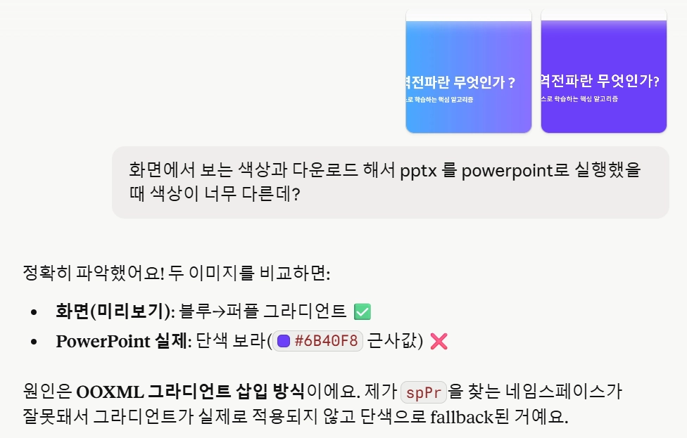
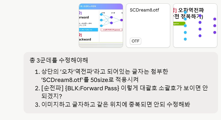
문제는 화면에서 보는 PPTX와 다운로드해서 보는 PPTX의 퀄리티, 특히 색상차이가 심함
•
이런식으로 최소 10번이상의 갈굼(?)과 정교화가 진행되어야 함!
2.
원하는 디자인이 나왔다면?
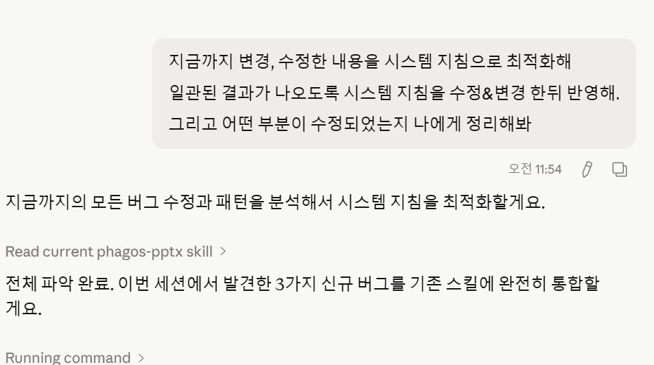
지금까지 변경, 수정한 내용을 시스템 지침으로 최적화해
일관된 결과가 나오도록 시스템 지침을 수정&변경 해서 md파일로 만들어봐
Plain Text
복사
3.
시스템 지침이 수정반영되었는지 확인하기 중간에 토큰이 부족해진다면 대략 난감!
중간에 토큰이 부족해진다면 대략 난감!4.
생성된 프롬프트를 프로젝트 지침에 저장 → 이후 동일 퀄리티 반복 생성 가능
5.
이 결과물을 스킬로도 만들 수 있음
6.
결과물: 초안치고는 상당히 괜찮음!

[프로젝트로 저장하냐? 스킬로 만드냐? 의 차이]
•
프로젝트 시스템 프롬프트(지침)
매 대화마다 자동 주입되는 방식. 프로젝트에 설정해두면 그 프로젝트 안의 모든 대화에서 해당 지침이 항상 활성•
Skill (대화 중 동적 로딩)
필요한 순간에만 view SKILL.md를 읽고 적용하는 방식3-2. 코워크 (Cowork) 활용
코워크 = 클로드가 내 컴퓨터에 직접 들어와서 작업하는 모드
데스크탑 앱에서만 사용 가능. 회사 내규 충돌 여부 사전 확인 필요[활용 사례]
- 크롬 웹 탐색 + 로컬 파일 참조로 풍성한 자료 조사
- 영수증 사진 폴더 → 엑셀 표 자동 정리 + 시간순 사진 정렬
- 대규모 데이터 추출 및 엑셀 작업 자동화
4. 마지막 꿀팁: AI한테 방법을 물어라
“내가 이런 업무를 하는데, 클로드를 어떻게 활용하면 효율적으로 할 수 있을까?”
•
업무를 상세하게 설명하면 클로드가 기능 추천 + 프롬프트 직접 제안
•
분야별 AI 팁이 없다면 클로드와 대화하며 직접 만들 수 있음
“클로드는 잠재력이 무궁무진한 툴. 어떻게 활용하느냐가 관건이다.”