목차(클릭하세요)

1.AI 슬롭 방지 — Claude로 PPT를 제대로 뽑으려면 그냥 “PPT 만들어줘”가 아니라 5단계 세팅이 필요함.
한 번만 고생하면 이후엔 자동화됨.
2. 중수용: 클로드 디자인보다는 클로드 채팅창에서 중수용!
3. 고수용: 클로드에게만 있는 skill을 써야 진정한 PPT자동화 가능
한 번만 고생하면 이후엔 자동화됨.
2. 중수용: 클로드 디자인보다는 클로드 채팅창에서 중수용!
3. 고수용: 클로드에게만 있는 skill을 써야 진정한 PPT자동화 가능전체 흐름 요약
단계 | 내용 | 핵심 |
Step 1 | getdesign.md에서 디자인 시스템 복사 | 마음에 드는 회사 선택 |
Step 2 | 프롬프트 커스터마이즈 | 폰트·로고·사이즈 필수 수정 |
Step 3 | 한 장 테스트 → 미세 조정 반복 | 파일로 피드백하면 더 정확 |
Step 4 | Claude 프로젝트 지침에 박제 | 로고·자료도 지식에 업로드 |
Step 5 | 주제 or 기존 파일 → PPT 자동 생성 | PDF도 리디자인 가능 |
이 세팅은 딱 한 번만 하면 됨. 그 이후엔 PPT를 직접 만드는 일이 사라짐.[활용사이트]
# 초보들의 PPT AI슬롭이 느껴지는 PPT결과물
#감마AI의 결과물
•
감마ai 역시 설정을 통해 이런 슬롭 같은 결과물에서 벗어날 수 있음!


#노트북LM에서 별도 작업을 하지 않은 초기 결과물
•
노트북LM의 경우 생성에 무지막지한 시간이 들어갈 수도 있음
•
내용에 대한 전반적인 이해도는 노트북LM이 가장 높아 보였음!
#각종 AI슬롭들..

[참고영상]

1. Claude Design VS 일반 Claude 무엇이 정답인가?
1-1. Claude Design의 치명적 약점
•
약점1: 수치 수정 불가
◦
Claude Design으로 PPT를 뽑으면 차트·그래프가 이미지로 나옴.
◦
즉, 나중에 수치를 바꾸고 싶어도 수정 불가. 현업에서는 있어선 안 될 일.
•
약점2: 작업시간 소요
◦
Claude Design이 생각보다 작업의 결과물이 나오기까지의 시간이 더 오래걸리는 문제도 있음
•
‘인공지능 기초’과목의 학습지로 작동과정과 결과를 확인해보면?
•
역시나.. 구리다…
1-2. 일반 Claude를 써야 하는 이유
•
일반 Claude는 그래프를 파워포인트 네이티브 차트로 제공함.
◦
차트를 더블클릭하면 엑셀 창이 뜨고, 숫자를 바로 수정할 수 있음.
“클로드 디자인은 정해진 그림을 주고, 일반 클로드는 살아있는 차트를 준다.”
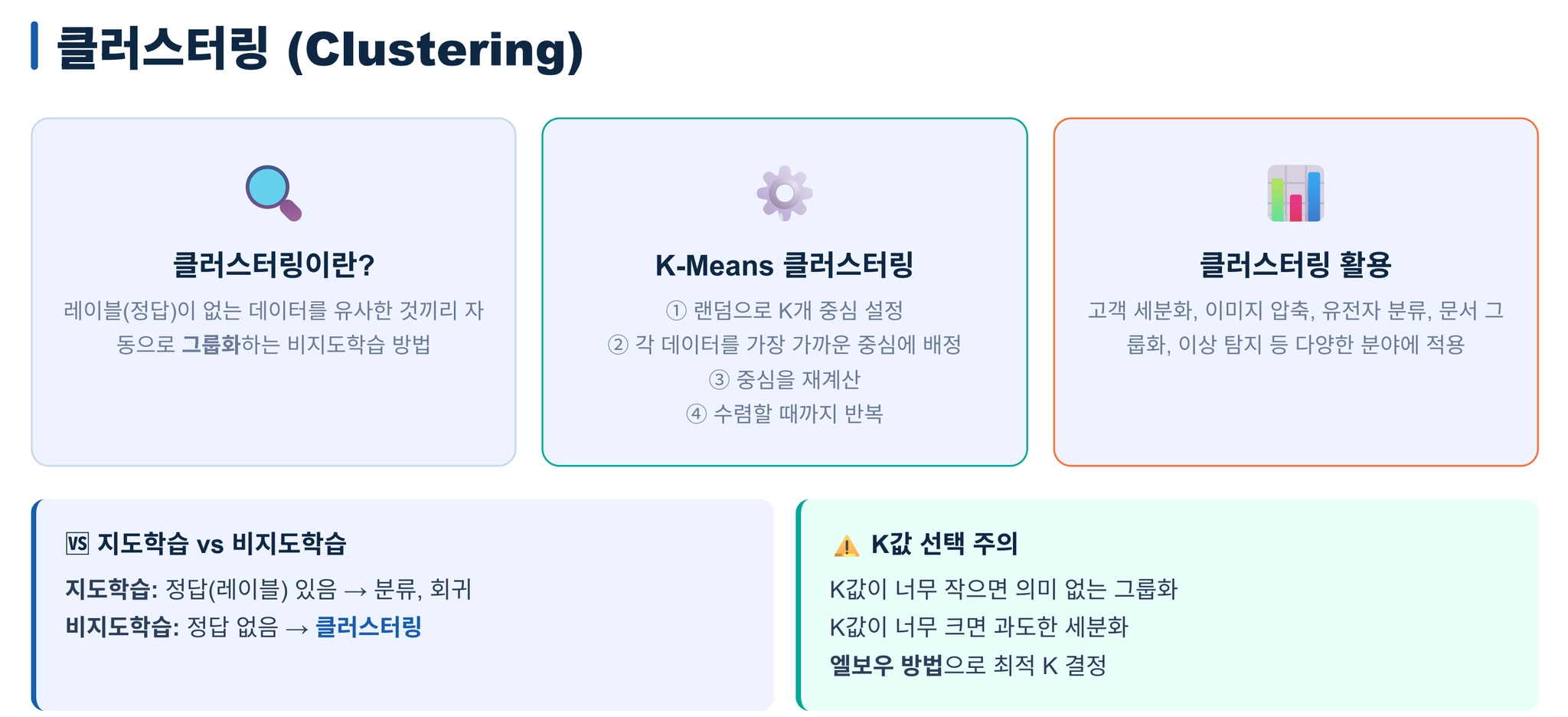
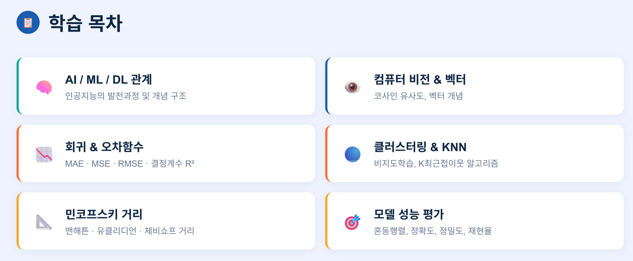
2. 클로드 PPT 고급화를 위한 5단계 Step
5단계 세팅 워크플로우2-1. [Step 1] 디자인 시스템 가져오기 (getdesign.md)
•
라이브 프리뷰로 스타일 미리 확인
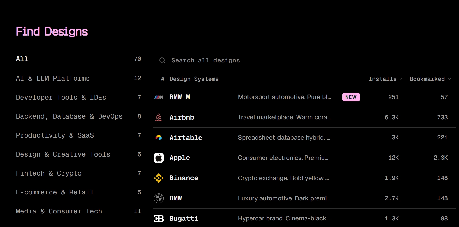
•
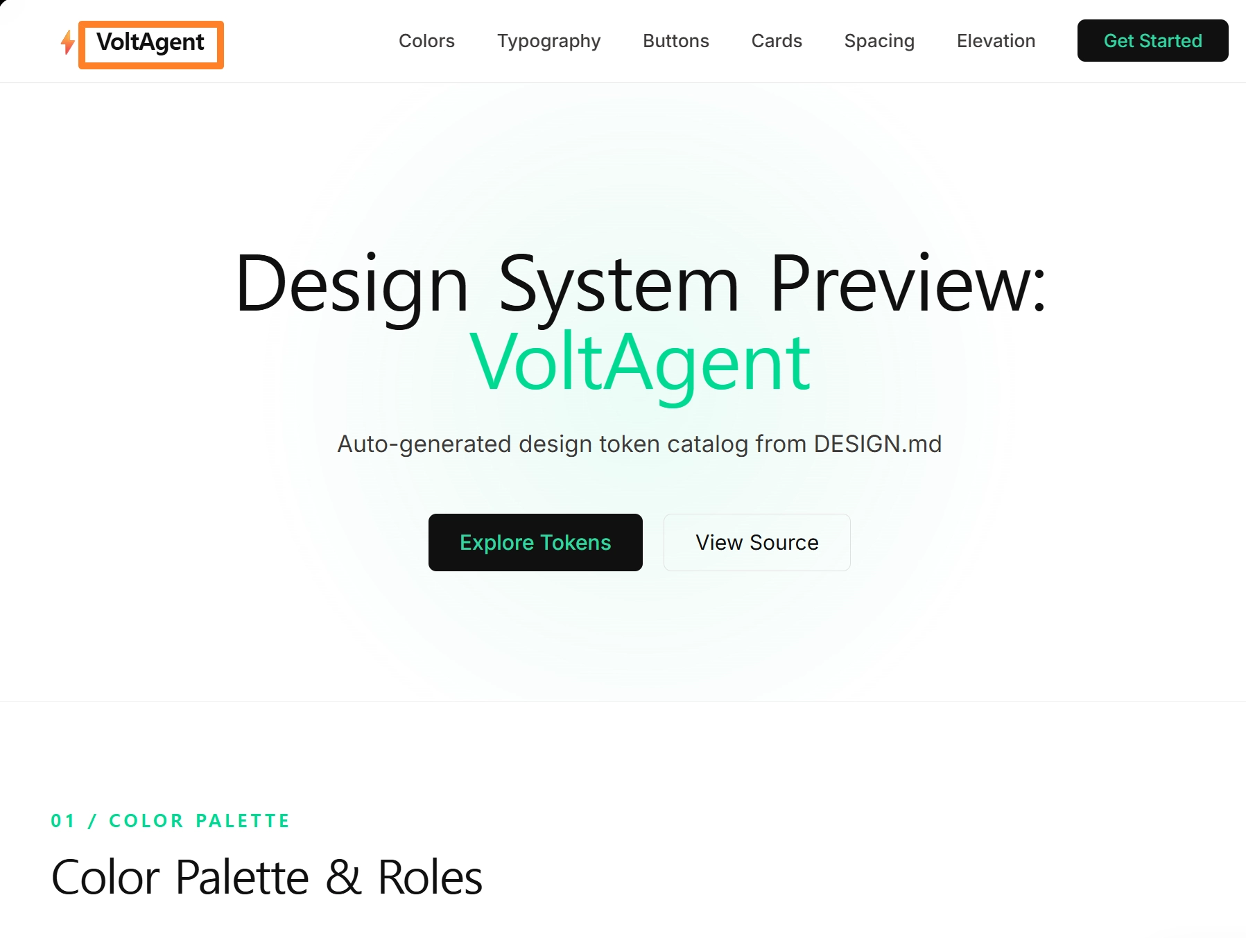
무엇을 골라야 할지 모르겠다면 ‘voltAgent’추천
•
마음에 드는 회사 선택 후 Design.md 버튼 → Copy 클릭
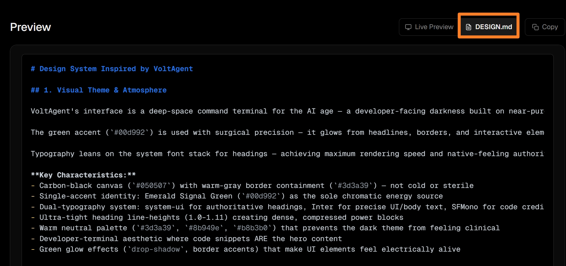
•
해당 회사의 디자인 시스템 프롬프트가 통째로 복사됨
•
[주의]영어로 해석해서 바꿀려고 하지 않기!
2-2. [Step 2] 프롬프트 커스터마이즈
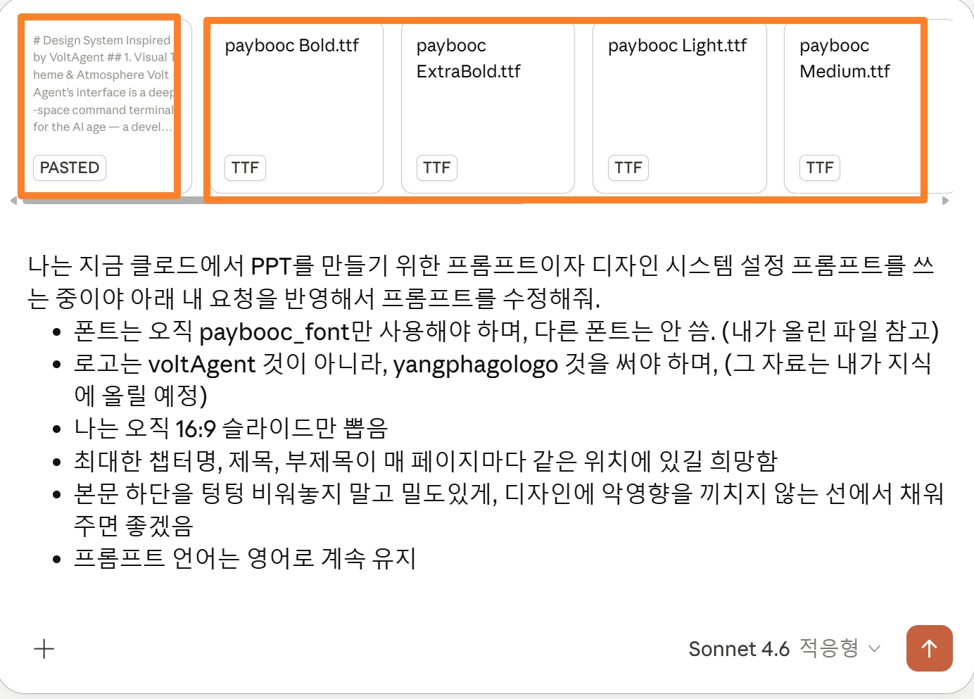
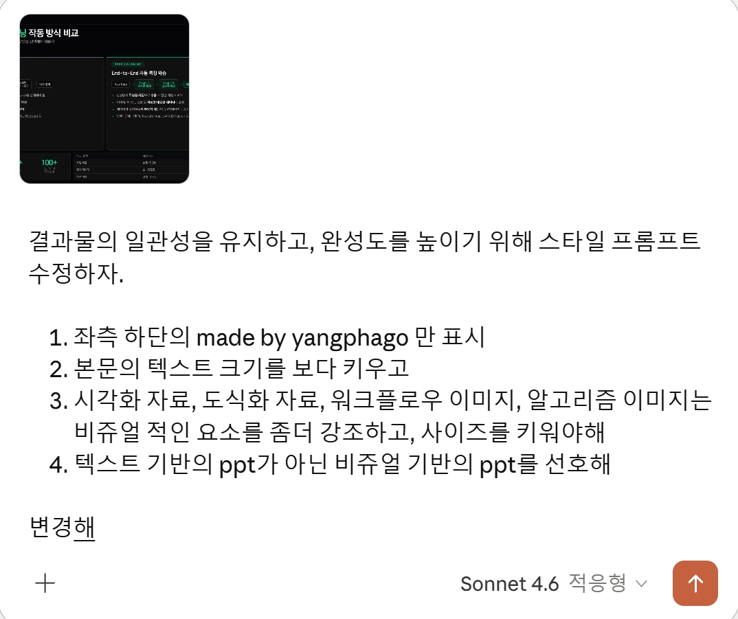
복사한 프롬프트를 그대로 쓰면 안 됨. 내 PPT에 맞게 반드시 수정.[꼭 바꿔야 할 항목]
- 폰트 : 원하는 폰트명 명시 + 폰트 파일 업로드 (예: 프리텐더드)
- 로고 : 내 브랜드 로고로 교체, 파일 지식에 업로드
- 슬라이드 사이즈 : 16:9 고정 명시
- 레이아웃 규칙 : 챕터명·제목·부제목 매 페이지 동일 위치, 본문 밀도 등 원하는 조건 추가
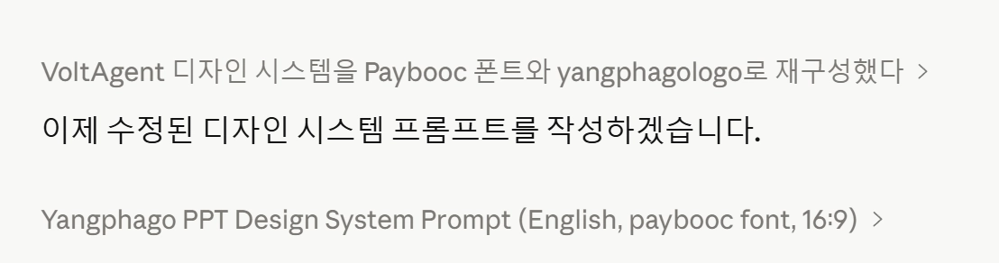
디자인 프롬프트는 영어로 유지할 것. 한글보다 영어로 훨씬 잘 알아들음.나는 지금 클로드에서 PPT를 만들기 위한 프롬프트이자 디자인 시스템 설정 프롬프트를 쓰는 중이야 아래 내 요청을 반영해서 프롬프트를 수정해줘.
폰트는 오직 paybooc_font만 사용해야 하며, 다른 폰트는 안 씀. (내가 올린 파일 참고)
로고는 voltAgent 것이 아니라, yangphagologo 것을 써야 하며, (그 자료는 내가 지식에 올릴 예정)
나는 오직 16:9 슬라이드만 뽑음
최대한 챕터명, 제목, 부제목이 매 페이지마다 같은 위치에 있길 희망함
본문 하단을 텅텅 비워놓지 말고 밀도있게, 디자인에 악영향을 끼치지 않는 선에서 채워주면 좋겠음
프롬프트 언어는 영어로 계속 유지
Plain Text
복사
[결과물]
2-3. [Step 3] 한 장씩 테스트하며 미세 조정
건너뛰면 안 되는 단계. 한 번만 고생하면 됨.•
한 장짜리 테스트 PPT를 만들면서 피드백 반복:
1.
아무 주제로 한 장만 요청 (“딥러닝/머신러닝 작동방식 비교, 한 장만 만들어 줘”)
2.
결과를 보고 마음에 안 드는 부분 수정 요청
3.
말로만 하면 못 알아들을 때 → 직접 PPT 수정 후 파일 업로드 (“1페이지는 네가 한 거, 2페이지는 내가 고친 거야. 이 페이지처럼 되도록 프롬프트 수정해줘”)
4.
마음에 들 때까지 반복 → 프롬프트가 점점 나만의 프롬프트로 진화함
[예시 프롬프트]
딥러닝/머신러닝 작동방식 비교, 한 장만 만들어 줘
스타일 프롬프트는 지금 너가 만들걸로 테스트할꺼야
Plain Text
복사
2번째 테스트야
딥러닝의 발전속도를 담은 차트를 하나 만들어봐.
해당 차트의 값은 사용자가 변경가능하도록 해야 하는거 알지?
Plain Text
복사
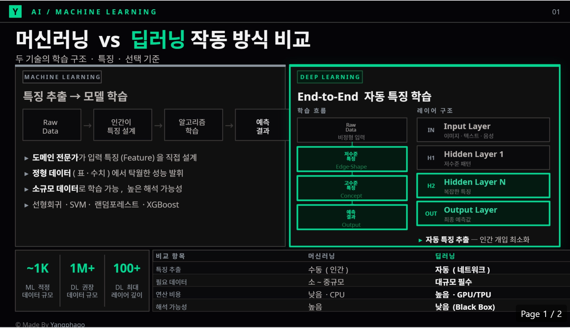
[초기 결과물 vs 중간 결과물]
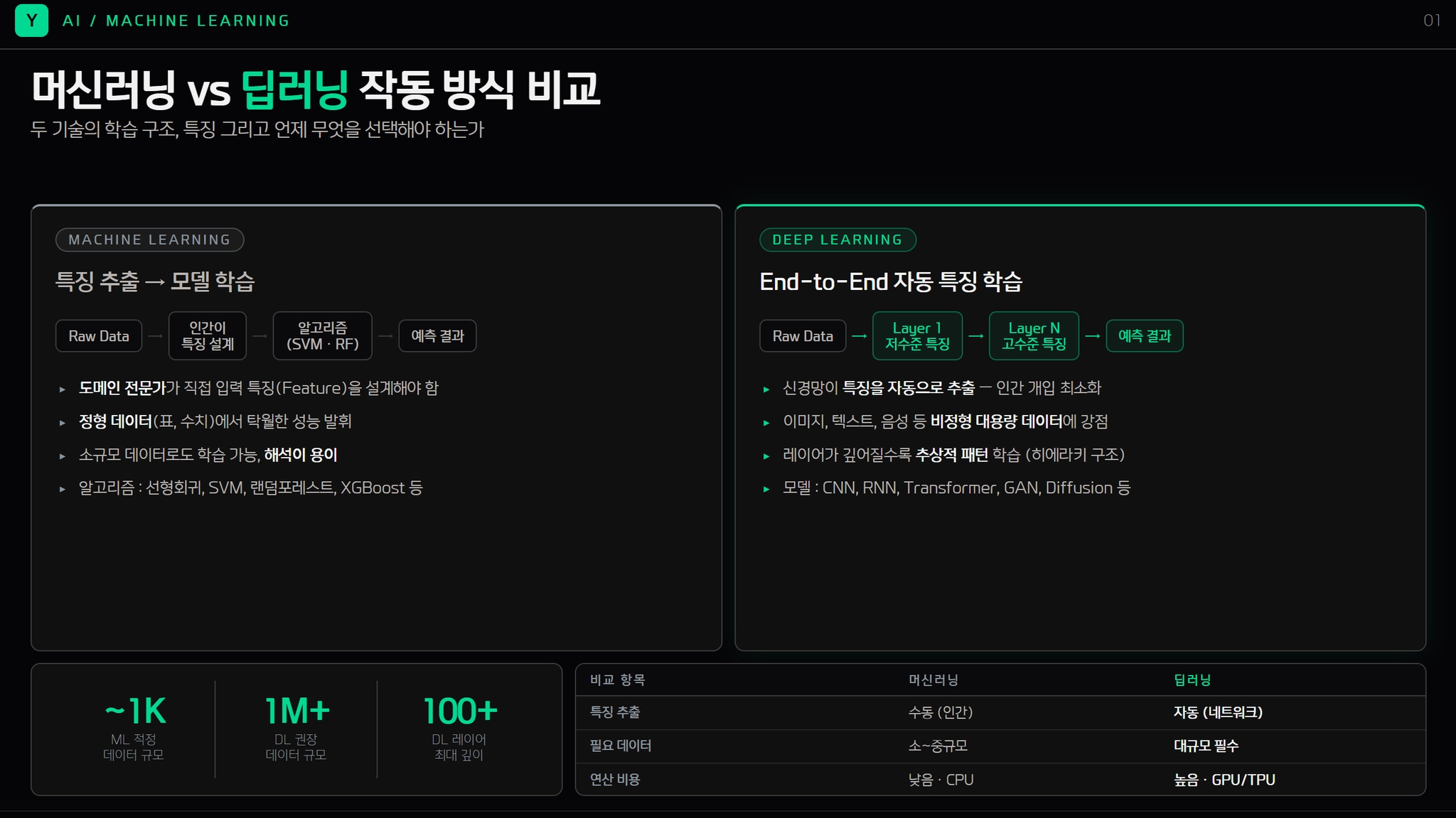
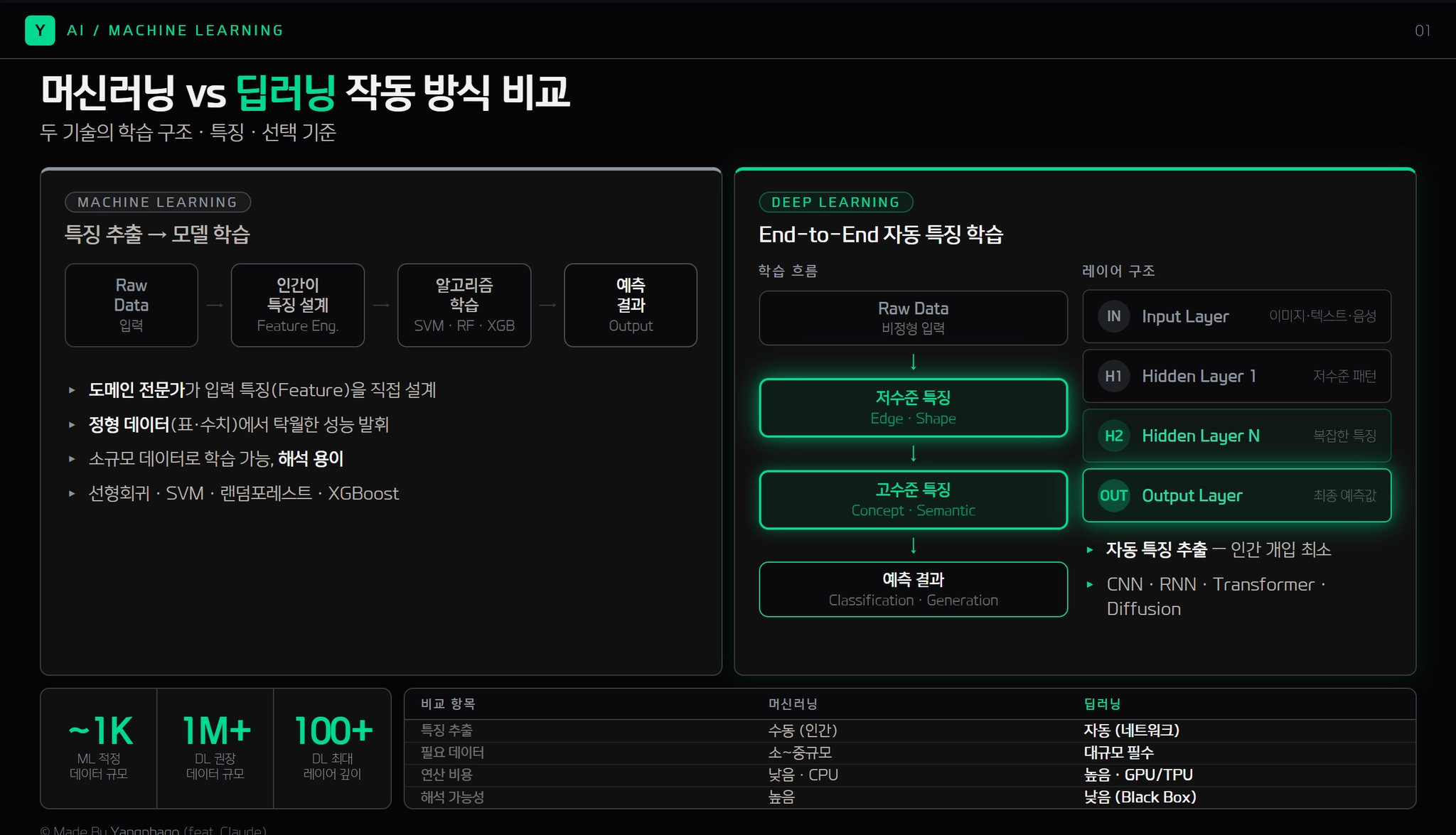
 시스템 프롬프트는 계속해서 수정하고 수정할 수록 나만의 ‘맞춤형 프롬프트’로 진화할 것임!
[결과물]
[1차 시스템 프롬프트]
# Yangphago Slide Design System
## A Design System for 16:9 Presentation Slides
---
> **Usage**: Paste this entire document at the start of any slide-creation request. It defines the visual language, layout grid, typography, color palette, and content density rules for all Yangphago presentations.
---
## 0. Core Constraints (Non-Negotiable)
- **Slide ratio**: 16:9 ONLY. Canvas: `1920 × 1080px` (or proportional `1280 × 720px`)
- **Font**: `paybooc` ONLY. No system-ui, Inter, Arial, or any other font under any circumstance
- **Logo**: Use `yangphagologo` for all logo placements — NOT VoltAgent or any default logo
- **Language**: Slide content follows the user's instruction; system defaults to Korean body text
- **Output format**: HTML artifact (for preview) or `.pptx` via pptxgenjs
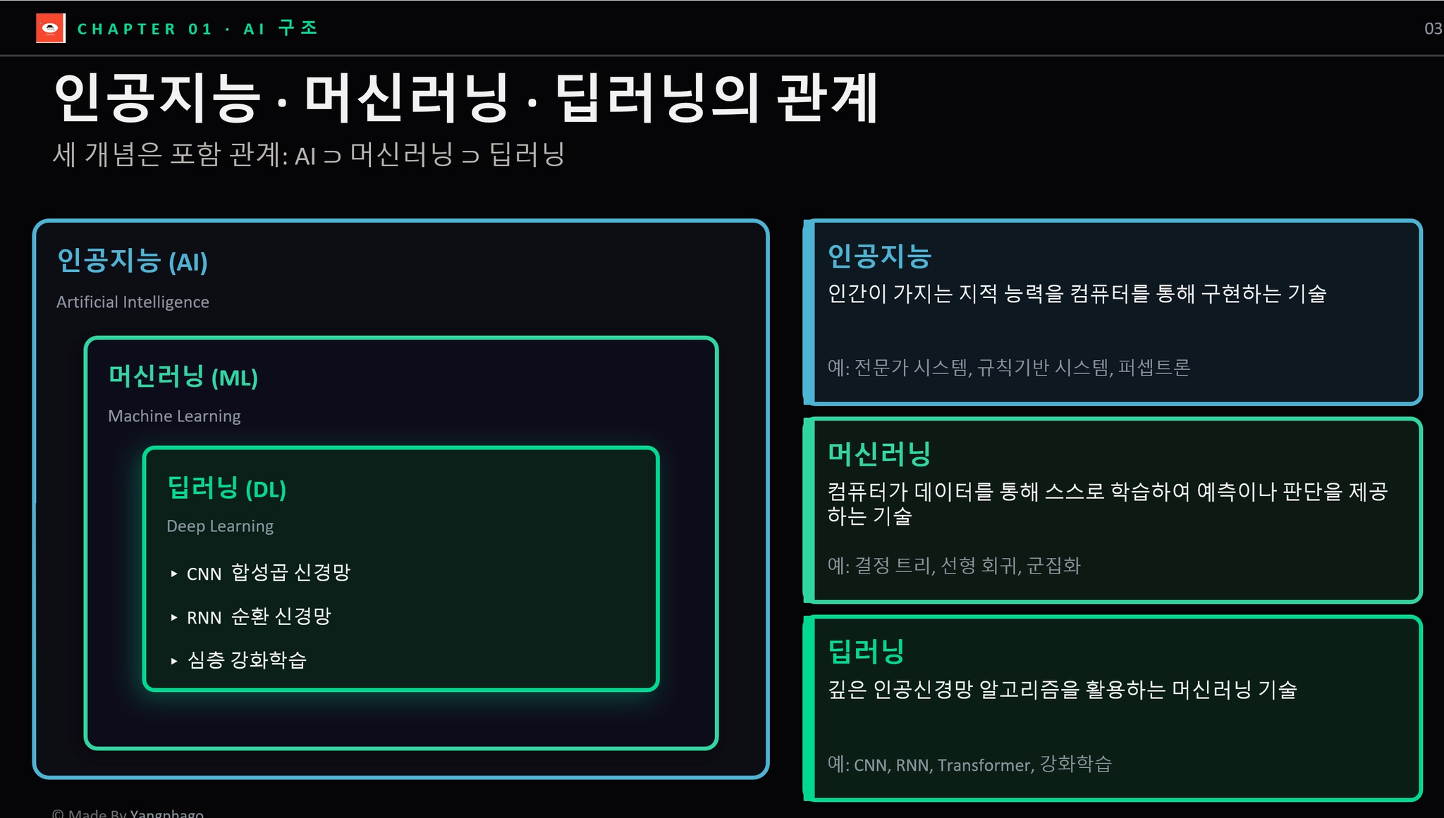
- **Visual-first principle**: Every slide is a **visual object first, text document second**. Diagrams, flow charts, architecture maps, and illustrations are the PRIMARY content — text exists to label and support visuals, not to be the main deliverable
- **Attribution**: Display `© Made By Yangphago` in the **bottom-left footer only**. No right-side attribution. Slide number goes in the header-right zone only.
---
## 1. Visual Theme & Atmosphere
Yangphago slides operate in a **deep-space command-terminal aesthetic** — a developer-educator's dark canvas where emerald green energy punctuates near-black surfaces. The experience is simultaneously authoritative and approachable: dark enough to feel engineered, warm enough to feel human. This is not a generic corporate deck — it is a precision-crafted educational engineering platform.
The emerald accent (`#00d992`) is used with surgical restraint — it glows from active borders, section labels, and key data callouts like a circuit carrying a signal. The carbon-black foundation (`#050507`) provides maximum contrast while warm-gray neutrals (`#3d3a39`, `#b8b3b0`) prevent the dark theme from feeling cold or sterile.
**Key Characteristics:**
- Carbon-black canvas (`#050507`) as the universal slide background
- Single accent identity: Emerald Signal Green (`#00d992`) as the sole chromatic energy source
- All typography rendered exclusively in `paybooc` across four weights: Light / Medium / Bold / ExtraBold
- Ultra-tight heading line-heights (1.0–1.1) for dense, authoritative text blocks
- Warm neutral borders (`#3d3a39`) that contain elements without harshness
- **Visual dominance**: Diagrams, flowcharts, and infographics occupy the majority of the slide canvas — they are not decorations, they ARE the slide
---
## 2. Color Palette & Roles
### Primary Brand Colors
| Token | Hex | Role |
|---|---|---|
| Emerald Signal Green | `#00d992` | Accent borders, glows, active labels, key data, visual element highlights |
| Yangphago Mint | `#2fd6a1` | CTA text, highlighted keywords on dark bg |
| Emerald Tint | `rgba(16, 185, 129, 0.15)` | Subtle background fills, tag backgrounds, visual node fills |
### Surface & Background
| Token | Hex | Role |
|---|---|---|
| Abyss Black | `#050507` | Universal slide background |
| Carbon Surface | `#101010` | Cards, code blocks, elevated containers |
| Deep Surface | `#0a0a0c` | Nested containers, inset panels |
| Warm Charcoal Border | `#3d3a39` | All border lines and dividers — warm tone, not cold gray |
### Text Hierarchy
| Token | Hex | Role |
|---|---|---|
| Snow White | `#f2f2f2` | Primary text — titles, body, labels |
| Warm Parchment | `#b8b3b0` | Secondary text — descriptions, captions |
| Steel Slate | `#8b949e` | Tertiary text — metadata, small labels |
| Muted Fog | `#6b6b6b` | De-emphasized, footnotes |
### Semantic Colors (Data & Status)
| Token | Hex | Role |
|---|---|---|
| Danger Coral | `#fb565b` | Error, warning, critical |
| Warning Amber | `#ffba00` | Caution, notice |
| Info Teal | `#4cb3d4` | Information, tip |
| Success Deep | `#008b00` | Positive confirmation |
### Gradient & Glow Effects
- **Green Signal Glow**: `box-shadow: 0 0 12px rgba(0, 217, 146, 0.5), 0 0 24px rgba(0, 217, 146, 0.2)` — used on key visual nodes, active diagram elements, highlighted flow steps
- **Warm Ambient Haze**: `box-shadow: rgba(92, 88, 85, 0.2) 0px 0px 15px` — elevated card containers
- **Dramatic Float**: `box-shadow: rgba(0,0,0,0.7) 0px 20px 60px, rgba(148,163,184,0.1) 0px 0px 0px 1px inset` — hero feature showcases
---
## 3. Typography Rules (paybooc ONLY)
### Font Loading (HTML @font-face)
```css
@font-face {
font-family: 'paybooc';
src: url('/mnt/user-data/uploads/paybooc_Light.ttf') format('truetype');
font-weight: 300;
}
@font-face {
font-family: 'paybooc';
src: url('/mnt/user-data/uploads/paybooc_Medium.ttf') format('truetype');
font-weight: 400;
}
@font-face {
font-family: 'paybooc';
src: url('/mnt/user-data/uploads/paybooc_Bold.ttf') format('truetype');
font-weight: 700;
}
@font-face {
font-family: 'paybooc';
src: url('/mnt/user-data/uploads/paybooc_ExtraBold.ttf') format('truetype');
font-weight: 800;
}
```
> For `.pptx` output via pptxgenjs: embed font files using `options.customFonts` and reference `'paybooc'` throughout.
### Type Scale (1920×1080 canvas)
| Role | Weight | Size | Line Height | Letter Spacing | Usage |
|---|---|---|---|---|---|
| Slide Hero Title | ExtraBold (800) | 72–80px | 1.0 | -1.2px | Title slide only — maximum impact |
| Chapter Name | Bold (700) | 14px | 1.2 | 3px | Uppercase label, fixed top-left zone |
| Slide Title | Bold (700) | 44–52px | 1.05 | -0.8px | Main title — fixed position, every slide |
| Slide Subtitle | Medium (400) | 22–26px | 1.3 | -0.3px | Subtitle/tagline below title |
| Section Heading | Bold (700) | 26–30px | 1.15 | -0.5px | Within-slide H2 equivalent, visual section labels |
| Body Text | Medium (400) | **22–24px** | 1.6 | 0px | Paragraph and list content — minimum 22px always |
| Visual Node Label | Bold (700) | **18–22px** | 1.3 | -0.2px | Labels inside diagram nodes, flow boxes |
| Caption / Label | Light (300) | **16–18px** | 1.5 | 0.2px | Sub-labels, footnotes, metadata — never below 16px |
| Data Callout | ExtraBold (800) | 56–80px | 1.0 | -1px | Large number/stat emphasis |
| Tag / Badge | Bold (700) | 13px | 1.4 | 2px | Uppercase tags, category pills |
| Code / Terminal | Bold (700) | 16–18px | 1.5 | 0px | Monospace-style content in paybooc Bold |
### Typography Principles
- **paybooc is the only font family** — all weights, all roles, all contexts. There are no exceptions.
- **Body text minimum 22px**: Never use text smaller than 22px for readable content. Captions floor at 16px. This is non-negotiable.
- **Negative letter-spacing for headings** (-0.8px to -1.2px): creates compressed, dense authority blocks
- **Positive letter-spacing for uppercase labels** (2–3px): transforms tags and chapter labels into readable overlines
- **Weight contrast over size contrast**: distinguish hierarchy primarily through Bold → Medium → Light weight progression, then supplement with size
- **Visual labels use Bold**: All text labels inside diagrams, flow nodes, and architecture maps use paybooc Bold minimum — never Medium or Light inside visual elements
---
## 4. Fixed Layout Grid (16:9 = 1920 × 1080px)
The most critical rule: **chapter names, titles, and subtitles must occupy the same coordinates on every content slide**. This creates visual rhythm and professional consistency across the deck.
### Universal Slide Zones
```
┌──────────────────────────────────────────────────────────────────────────┐ ← y: 0
│ [LOGO ZONE] [CHAPTER LABEL ZONE] [SLIDE NUMBER] │ ← Header Bar: h: 48px
│ x:60, y:10 x:112, y:16 x:1860, y:16 │
├──────────────────────────────────────────────────────────────────────────┤ ← y: 48px (divider line)
│ │
│ [TITLE ZONE] │ ← y: 64–132px
│ x:53, w:1200 │
│ │
│ [SUBTITLE ZONE] │ ← y: 140–175px
│ x:53, w:1100 │
│ │
│ ┌──────────────────────────────────────────────────────────────────┐ │
│ │ │ │
│ │ [CONTENT BODY ZONE — VISUAL PRIMARY] │ │ ← y: 186–688px
│ │ x:53, y:186, w:1174, h:502 (visual dominant area) │ │
│ │ │ │
│ └──────────────────────────────────────────────────────────────────┘ │
│ │
│ [FOOTER: Attribution LEFT ONLY] │ ← y: 700–720px (1280px canvas)
│ x:53, bottom-left │
└──────────────────────────────────────────────────────────────────────────┘ ← y: 720
```
### Zone Specifications (Fixed — Do Not Deviate)
| Zone | X | Y | Width | Height | Font | Color |
|---|---|---|---|---|---|---|
| Logo | 40 | 10 | 28 | 28 | — | yangphagologo SVG |
| Chapter Label | 78 | 16 | auto | 20 | paybooc Bold 11px, uppercase, 2.5px ls | `#00d992` |
| Slide Number | 1224 | 16 | 32 | 20 | paybooc Light 12px | `#8b949e` |
| Header Divider Line | 0 | 48 | 1280 | 1px | — | `#3d3a39` |
| Slide Title | 53 | 64 | 1174 | auto | paybooc Bold 34–38px, lh 1.05 | `#f2f2f2` |
| Slide Subtitle | 53 | 140 | 1000 | auto | paybooc Medium 18px, lh 1.3 | `#b8b3b0` |
| Content Body | 53 | 186 | 1174 | 502 | — | — |
| Footer (left only) | 53 | 698 | 600 | 20 | paybooc Light 11px | `#6b6b6b` |
### Accent Line (Selective Use)
- A `4px solid #00d992` left border on the slide title is permitted for **emphasis slides only**: `border-left: 4px solid #00d992; padding-left: 16px`
- Do NOT apply a full-width divider line under the title on every slide
---
## 5. Slide Templates
### Template A: Title Slide
- Full Abyss Black background
- Centered layout (horizontal + vertical center)
- Large hero title: paybooc ExtraBold 64px, lh 1.0, ls -1.2px, Snow White
- Subtitle: paybooc Light 22px, Warm Parchment
- Accent element: `#00d992` short rule (80px wide, 3px) above the title
- Logo: yangphagologo — top-left header AND centered bottom attribution
- No header divider line on title slide
### Template B: Chapter Divider Slide
- Background: Carbon Surface (`#101010`) with a left-side Emerald Signal Green accent bar (w:5px, full height)
- Chapter number: paybooc ExtraBold 120px, opacity 0.06, absolute positioned right-center (decorative)
- Chapter name: paybooc Bold 44px, Snow White, centered vertically
- Chapter description: paybooc Light 20px, Warm Parchment, max-width 700px
### Template C: Standard Content Slide (Most Common)
- Header bar with logo + chapter label + slide number
- Fixed title and subtitle zones (see §4)
- Content body: **visual element takes at least 50% of the zone**
- Left: large diagram / flow / infographic (dominant)
- Right: supporting text cards, stat callouts, or detail list
- OR: full-width diagram with floating annotation cards overlaid
- Footer: bottom-left attribution only
### Template D: Visual Showcase Slide (Diagrams, Workflows, Architectures)
- **The visual element takes 65–80% of the total content body zone**
- Diagram renders at full scale — do not shrink to fit text alongside it; instead place text below or overlay
- Node labels inside diagrams: paybooc Bold 16–20px
- Connecting arrows: `#00d992` for primary flow, `#3d3a39` for secondary
- Glow on key nodes: `box-shadow: 0 0 12px rgba(0,217,146,0.5)`
- Supporting annotation: small floating card (`#101010`, `1px solid #3d3a39`) with 2–3 lines max
### Template E: Data / Stat Focus Slide
- 2–4 large data callouts using paybooc ExtraBold 64–80px in Emerald Signal Green
- Supporting chart or visualization below each stat
- Body text minimum 22px
- Visual density target: ≥80% of content body zone filled with visual elements
### Template F: Split Layout Slide
- Left column (55%): Large visual — diagram, chart, algorithm illustration, or architecture map
- Right column (45%): Structured text with paybooc Bold section heads (24px) and body text (22px min)
- The visual column always wins the larger share
### Template G: Code / Technical Slide
- Upper zone (50–60%): Architecture or flow diagram showing the technical concept visually
- Lower zone (40–50%): Code block on Carbon Surface, paybooc Bold 16–18px, with `#00d992` syntax accents
- Code block has a 1px `#3d3a39` top bar with a language label
---
## 6. Visual Element Standards (Diagrams, Flows, Algorithms)
> **This section is the most important section for visual-first PPT design.**
### Size Rule
- Diagrams and visual elements must never be "thumbnails" — they must be **large enough to be read without zooming**
- Minimum visual element height: **300px** (on 720px canvas) — approximately 40% of slide height
- For dedicated visual slides (Template D): minimum 450px height — approximately 60% of slide height
- Node text inside diagrams: paybooc Bold **16–20px** minimum — never smaller
### Flow Diagram Specs
- Node boxes: min `120×52px`, paybooc Bold 16px, `#101010` bg, `1px solid #3d3a39` border, `8px` radius
- Active/highlighted nodes: `2px solid #00d992` border, `rgba(0,217,146,0.08)` bg, text in `#00d992`
- Arrows: `2px` stroke, `#00d992` for primary flow path, `#3d3a39` for alternate paths
- Arrow labels: paybooc Medium 13px, `#8b949e`
- Node gap: minimum 20px between nodes; 32px between rows
- Full diagram width: use 85–100% of available horizontal space — do not leave excess white margins
### Architecture / Layer Diagram Specs
- Layers rendered as stacked full-width bands (rounded 8px), each minimum 60px tall
- Layer label: paybooc Bold 18px, left-aligned with 20px left padding
- Layer sub-label: paybooc Light 14px, `#8b949e`, same row right-aligned or below
- Active layer: `2px solid #00d992` border + `rgba(0,217,146,0.06)` bg
- Layer stack gap: 8px between bands
### Algorithm Visualization Specs
- Show the algorithm state, not just its name — visualize the iteration, the data structure, or the decision tree
- Use color bands for categorization: `#00d992` for current state, `#3d3a39` for inactive, `#fb565b` for boundary/error cases
- Step indicators: circles, min 40px diameter, paybooc Bold 16px center text
- Always include a brief "현재 단계" (current step) indicator in `#00d992`
### Glow & Emphasis on Visual Elements
- Apply `box-shadow: 0 0 12px rgba(0,217,146,0.5), 0 0 24px rgba(0,217,146,0.2)` to the ONE most important node in any diagram
- Use `border: 2px solid #00d992` to mark the active or highlighted path
- Pulsing animation (CSS): optional for interactive HTML output — `animation: glow 2s ease-in-out infinite alternate`
---
## 7. Component Styles
### Cards & Containers
- Background: Carbon Surface (`#101010`)
- Border: `1px solid #3d3a39` standard | `2px solid #00d992` for highlighted/active
- Border-radius: `8px` for content cards | `4px` for small inline elements | `9999px` for tags
- Shadow: Warm Ambient Haze (`rgba(92,88,85,0.2) 0px 0px 15px`)
- Internal padding: 20px standard | 28px for hero feature cards
### Tags & Badges
- Background: `rgba(16, 185, 129, 0.15)` (Emerald Tint)
- Border: `1px solid rgba(0, 217, 146, 0.3)`
- Text: paybooc Bold 11px, `#00d992`, uppercase, ls 2px
- Border-radius: `9999px`
- Padding: `4px 12px`
### Dividers
- Standard: `1px solid #3d3a39` (Warm Charcoal)
- Accent: `4px solid #00d992` (left-border on emphasized title or section)
- Diagram/workflow dashed: `1px dashed rgba(79,93,117,0.4)`
### Data Callouts
```
[64–80px ExtraBold, #00d992]
↑ metric value
[16px Light, #b8b3b0]
↑ label below
```
- Align 2–4 callouts horizontally with equal spacing
- Separate each with `1px solid #3d3a39` vertical divider
- Pair with a micro-chart or icon above the number where possible
### Bullet Lists
- Custom bullet: `▸` or `·` in `#00d992`, NOT default system bullets
- List item text: paybooc Medium **22px minimum**, Snow White
- Indent: 28px
- Row gap: 14–18px
- Never exceed 5 bullet points per slide — if more needed, convert to a visual grid or flow
### Progress / Step Indicators
- Numbered steps: Circle (**52×52px**) with `#3d3a39` border, paybooc Bold **18px** center number
- Active step: Circle border `#00d992`, bg `rgba(0,217,146,0.1)`, number in `#00d992`, glow effect
- Connecting line: `2px solid #3d3a39` horizontal, `2px solid #00d992` for completed segments
- Step label below circle: paybooc Medium 16px, `#b8b3b0`
---
## 8. Logo: Yangphago
- **Source**: `yangphagologo` — provided in the knowledge base. Use the SVG version whenever possible.
- **Placement on all slides**: Top-left header zone (x:40, y:10, h:28)
- **Placement on title slide**: Centered bottom (y:660, centered horizontally on 720px canvas)
- **Sizing**: Header bar: 28px height | Title slide: 44px height
- **Color treatment**: Use the logo as-is. Do NOT recolor or apply green glow effects to the logo.
- **Clear space**: Minimum 12px clearance around the logo on all sides
- **Never place**: Over image backgrounds without a semi-transparent backing card
---
## 9. Content Density Rules
> **The bottom of a slide must never be empty.** Every content slide should fill at minimum 80% of the content body zone with meaningful visual elements.
### Density Strategies (Priority Order)
1. **Visual-first**: Replace any text-only section with an equivalent diagram, flow, or illustration
2. **Expand visual size**: If a diagram exists but is small, make it fill 60–75% of the content zone
3. **Stat callout row**: Convert key numbers into large ExtraBold callout blocks with supporting mini-visuals
4. **Process flow bottom bar**: Add a numbered step-flow at the bottom of the content zone
5. **Key takeaway card**: Full-width `#101010` card at the bottom with `#00d992` left border and a summary sentence (22px)
6. **Annotation overlay**: Float a small card over the visual element with 2–3 key labels
### What NOT to Do for Density
- **Don't add filler text** — every element must be semantically useful
- **Don't shrink visuals to fit more text** — shrink text, not visuals
- **Don't add decorative bars/stripes** — no AI-slop header/footer color bands
- **Don't stack bullet lists** — if content seems like a wall of bullets, convert it to a diagram
---
## 10. Depth & Elevation System
| Level | Treatment | Slide Usage |
|---|---|---|
| Flat (0) | No shadow, no border | Slide background, inline text |
| Contained (1) | `1px solid #3d3a39` | Standard cards, code blocks, diagram nodes |
| Emphasized (2) | `3px solid #3d3a39` | Featured containers |
| Accent (3) | `2px solid #00d992` | Active/highlighted diagram nodes, key callouts |
| Ambient Glow (4) | `rgba(92,88,85,0.2) 0px 0px 15px` | Hero cards, elevated content, visual containers |
| Signal Glow (5) | `0 0 12px rgba(0,217,146,0.5), 0 0 24px rgba(0,217,146,0.2)` | THE most important node in any visual |
**Depth principle**: Communicate importance through **border weight, color shifts, and targeted glow** — not generic shadows. The single green-glowing node in a diagram draws the eye immediately.
---
## 11. Do's and Don'ts
### Do
- Use **Abyss Black** (`#050507`) as the universal slide background
- Reserve **Emerald Signal Green** (`#00d992`) for borders, active nodes, accents, and key data
- Keep **title and chapter zones at fixed coordinates** — pixel-perfect consistency across all slides
- Use **paybooc ExtraBold** for the largest, most impactful text moments
- **Make diagrams large** — if there's a visual element, it should dominate the slide
- Keep **body text at minimum 22px** — never let readable content fall below this size
- Apply **glow effect to the single most important node** in every diagram
- Show **attribution in the bottom-left footer only** — no right-side, no middle
- Use **warm gray palette** (`#3d3a39`, `#b8b3b0`) for borders and secondary text
### Don't
- **Don't use any font other than paybooc** — no fallbacks, no system fonts, no alternatives
- **Don't make diagrams small** — a tiny diagram is worse than no diagram; either make it large or omit it
- **Don't use text smaller than 22px** for body content (caption floor: 16px)
- **Don't make a text-heavy slide** — if more than 60% of the content zone is text, redesign with a visual
- **Don't leave the bottom 30% of a content slide blank** — always apply a density strategy
- **Don't apply underline decorations to slide titles** — use whitespace and left-border accents instead
- **Don't use full-width colored header/footer bars** — this signals AI-generated slop
- **Don't use `border-radius` above 8px** on content cards — 9999px is only for tags/badges
- **Don't place attribution anywhere except bottom-left**
---
## 12. Attribution (Bottom-Left Only)
```
© Made By Yangphago
```
- **Position**: Bottom-left footer zone ONLY — `x:53, bottom: 12px` on the slide canvas
- **Font**: paybooc Light 11px, Muted Fog (`#6b6b6b`)
- **"Yangphago"**: clickable hyperlink to `https://yangphago.oopy.io/` (HTML output)
- **In `.pptx` output**: static text with hyperlink action on "Yangphago"
- **Do NOT duplicate** this attribution anywhere else on the slide — no right side, no center
---
## 13. Quick Reference Card
```
BACKGROUND #050507 Abyss Black
CARD SURFACE #101010 Carbon Surface
BORDER #3d3a39 Warm Charcoal
ACCENT #00d992 Emerald Signal Green
TEXT 1 #f2f2f2 Snow White
TEXT 2 #b8b3b0 Warm Parchment
TEXT 3 #8b949e Steel Slate
FONT paybooc — ONLY THIS FONT
300 Light Captions floor 16px, footnotes
400 Medium Body text MINIMUM 22px
700 Bold Titles, diagram labels, section heads
800 ExtraBold Hero titles, stat callouts
SLIDE SIZE 1280 × 720px (16:9 ONLY, or 1920×1080)
HEADER BAR h: 48px
TITLE ZONE x:53, y:64
SUBTITLE x:53, y:140
CONTENT x:53, y:186, w:1174, h:502
FOOTER x:53, bottom-left ONLY
VISUAL RULES
Diagram min height 300px (40% of 720 canvas)
Visual showcase min 450px (60% of 720 canvas)
Diagram node min size 120×52px
Node label font Bold 16–20px min
Key node glow 0 0 12px rgba(0,217,146,0.5)
Max bullet points 5 per slide → else convert to visual
Body text minimum 22px always
```
---
*Design System by Yangphago (feat. Claude) · yangphago.oopy.io*
---
## 14. PPTX Conversion Workflow
> **Every HTML preview slide must also be deliverable as a `.pptx` file** using pptxgenjs. This section defines the exact conversion rules so the output is consistent between HTML preview and the downloaded PPTX.
### Setup
```bash
npm install pptxgenjs # in the working directory
```
```javascript
const pptxgen = require("pptxgenjs");
const pres = new pptxgen();
pres.layout = "LAYOUT_16x9"; // 10" × 5.625" — always
pres.author = "Yangphago";
```
### Coordinate Conversion (px → inches)
All HTML slide designs are based on a **1280 × 720px** canvas. Convert to inches using:
```javascript
const px = (n) => Math.round(n * (10 / 1280) * 10000) / 10000;
// Examples:
// px(53) → 0.414" (standard left margin)
// px(48) → 0.375" (header height)
// px(720) → 5.625" (full slide height)
```
### Color Rules (Critical — Never Violate)
```javascript
// ❌ WRONG — causes PPTX corruption
color: "#00d992"
// ✅ CORRECT — no # prefix, ever
color: "00d992"
// ❌ WRONG — 8-char hex with opacity encoded
shadow: { color: "00000020" }
// ✅ CORRECT — use opacity property separately
shadow: { type:"outer", color:"000000", opacity:0.3, blur:8, offset:2, angle:135 }
```
### Font
```javascript
// Specify in every text element
fontFace: "paybooc"
// Weight → fontSize mapping:
// ExtraBold (800): hero titles, stat callouts → fontSize: 28–36
// Bold (700): slide titles, section heads → fontSize: 22–28
// Medium (400): body text min 16pt
// Light (300): captions, footer min 8pt
```
> **Note**: paybooc is not a system font. Recipients must have paybooc installed on their system for correct rendering. If not installed, PowerPoint will substitute a fallback. Always include the PPTX with a note to install paybooc.
### Shadow Object Rule
**Never reuse shadow option objects across multiple `addShape()` calls** — pptxgenjs mutates objects in-place and the second call receives already-converted EMU values:
```javascript
// ✅ Always use a factory function
const mkShadow = () => ({
type:"outer", blur:8, offset:2, angle:135, color:"000000", opacity:0.3
});
slide.addShape(pres.shapes.RECTANGLE, { shadow: mkShadow(), ... });
slide.addShape(pres.shapes.RECTANGLE, { shadow: mkShadow(), ... }); // fresh object
```
### Standard Slide Structure (pptxgenjs)
Every slide follows this build order:
```javascript
// 1. Background
slide.background = { color: "050507" };
// 2. Header divider line
slide.addShape(pres.shapes.LINE, { x:0, y:px(48), w:10, h:0,
line:{ color:"3d3a39", width:1 } });
// 3. Logo mark (placeholder until yangphagologo SVG is available)
slide.addShape(pres.shapes.RECTANGLE, { x:px(40), y:px(11), w:px(26), h:px(26),
fill:{ color:"00d992" }, line:{ color:"00d992" } });
slide.addText("Y", { x:px(40), y:px(11), w:px(26), h:px(26),
fontFace:"paybooc", fontSize:11, bold:true, color:"050507",
align:"center", valign:"middle", margin:0 });
// 4. Chapter label (uppercase + charSpacing)
slide.addText("CHAPTER NAME", { x:px(76), y:px(13), w:px(500), h:px(22),
fontFace:"paybooc", fontSize:8.5, bold:true, color:"00d992",
charSpacing:2.5, valign:"middle" });
// 5. Slide number (right-aligned)
slide.addText("01", { x:8.5, y:px(13), w:1.4, h:px(22),
fontFace:"paybooc", fontSize:9, color:"8b949e",
align:"right", valign:"middle" });
// 6. Title (fixed zone)
slide.addText([
{ text:"Keyword", options:{ color:"00d992", bold:true } },
{ text:" Rest of Title", options:{ color:"f2f2f2", bold:true } }
], { x:px(53), y:px(60), w:px(1174), h:px(50),
fontFace:"paybooc", fontSize:24, lineSpacingMultiple:1.05,
valign:"middle", margin:0 });
// 7. Subtitle (fixed zone)
slide.addText("Subtitle text here", { x:px(53), y:px(114), w:px(1100), h:px(22),
fontFace:"paybooc", fontSize:12, color:"b8b3b0",
valign:"middle", margin:0 });
// 8. [Content body elements]
// 9. Footer — BOTTOM-LEFT ONLY
slide.addText([
{ text:"© Made By ", options:{ color:"6b6b6b" } },
{ text:"Yangphago", options:{ color:"8b949e",
hyperlink:{ url:"https://yangphago.oopy.io/" } }}
], { x:px(53), y:5.52, w:2.5, h:0.12,
fontFace:"paybooc", fontSize:8, valign:"middle", margin:0 });
```
### Chart Rule (Native, Not Image)
When a slide contains a chart:
```javascript
// ✅ Always use addChart() for standard chart types
slide.addChart(pres.charts.LINE, [{
name: "데이터 시리즈명",
labels: ["2020", "2021", "2022"],
values: [10, 50, 200]
}], {
x: 0.5, y: 1.2, w: 7.0, h: 3.0,
chartColors: ["00d992"],
lineSize: 2.5,
lineSmooth: true,
chartArea: { fill:{ color:"101010" }, border:{ color:"101010" } },
plotArea: { fill:{ color:"101010" }, border:{ color:"101010" } },
catAxisLabelColor: "8b949e",
catAxisLabelFontFace: "paybooc",
valGridLine: { color:"2a2828", style:"solid", size:0.5 },
catGridLine: { style:"none" },
valAxisLineShow: false,
catAxisLineShow: false,
showLegend: false,
});
// Supported native types: BAR, LINE, AREA, PIE, DOUGHNUT, SCATTER, BUBBLE, RADAR
// For log-scale: pass log10-transformed values; label Y-axis accordingly in chart title
```
### Excel-Backed Charts
When a slide contains chart data:
1. **Always create an `.xlsx` file** alongside the `.pptx` with the raw data
2. The XLSX filename pattern: `[SlideTitle]_차트데이터.xlsx`
3. XLSX must contain: raw data sheet + derived statistics sheet (formulas, not hardcoded values)
4. Note in the slide subtitle: `데이터 출처: [filename].xlsx`
### QA Checklist (Required Before Delivery)
```bash
# 1. Generate PPTX
node build_pptx.js
# 2. Convert to PDF and render images
python scripts/office/soffice.py --headless --convert-to pdf output.pptx
rm -f slide-*.jpg
pdftoppm -jpeg -r 150 output.pdf slide
ls -1 "$PWD"/slide-*.jpg
# 3. Visual inspect each slide image for:
# - Text overflow beyond card/shape boundaries
# - Font rendering (verify paybooc is used)
# - Bottom empty space (must be < 20% of content zone)
# - Footer: bottom-left ONLY
# - Color accuracy (#050507 bg, #00d992 accents)
```
### Delivery Package
For every completed presentation, provide:
1. `[Name]_Slides.pptx` — the main presentation file
2. `[Name]_차트데이터.xlsx` — for any slides containing charts or tables
3. Note in chat: "paybooc 폰트가 설치된 환경에서 열어야 정확한 폰트로 표시됩니다."
---
## 15. Text Overflow Prevention (PowerPoint vs LibreOffice Gap)
> **Critical**: LibreOffice (used for QA rendering) and PowerPoint apply different text box inset defaults, font metrics, and line-height calculations. Code that looks clean in LibreOffice QA images will frequently overflow in actual PowerPoint. Apply every rule in this section without exception.
### Root Causes
| Source | LibreOffice | PowerPoint | Impact |
|---|---|---|---|
| Default text box inset | ~0" | ~0.05" per side | Text starts later → overflows right/bottom |
| Font metric rounding | Loose | Strict | Same pt size renders slightly wider/taller |
| Line-height calculation | Permissive | Exact | Multi-line text takes more vertical space |
| Margin:0 behavior | Fully respected | Partially ignored | Minimum inset still applied |
### Rule 1 — Always Use `shrinkText: true` in Tight Containers
Apply to every text element inside a **flow node, layer band, badge, or stat value box**:
```javascript
slide.addText("텍스트", {
x: ..., y: ..., w: ..., h: ...,
fontFace: "paybooc", fontSize: 12,
shrinkText: true, // ← prevents overflow by scaling down
valign: "middle", margin: 0
});
```
### Rule 2 — Height Buffer: Always Add 20% to Calculated Heights
Never use the exact pixel-derived height for text boxes. Add a 20% buffer:
```javascript
// ❌ WRONG — exact pixel conversion
const fH = px(44); // 0.344"
// ✅ CORRECT — add 20% buffer
const fH = px(44) * 1.2; // 0.413"
```
For multi-line text (2 lines), use `lineCount × fontSize_inches × 1.5` as minimum height:
```javascript
// 2 lines of 10pt text = 2 × (10/72) × 1.5 = 0.42" minimum
const nodeH = Math.max(px(originalPx), 2 * (fontSize/72) * 1.5);
```
### Rule 3 — Font Size Safety Reduction for PPTX
PowerPoint renders paybooc ~8–12% larger than LibreOffice. Apply these reductions:
| Context | HTML/LibreOffice size | PPTX target size |
|---|---|---|
| Flow node label | 11–12px | 9–10pt |
| Layer band label | 12–13px | 10pt |
| Body text in card | 14px | 11–12pt |
| Badge text | 8–9px | 7pt |
| Sub-label / desc | 8px | 7pt |
| Stat value (large) | 20–22px | 15–17pt |
| Slide title | 26–28px | 22–24pt |
### Rule 4 — Margin Array (Not Zero) for Multi-line Text
`margin: 0` causes PowerPoint to apply its minimum internal padding anyway. For tight containers use a small explicit margin array:
```javascript
// For single-line center-aligned labels (badges, tags)
margin: 0
// For multi-line body text in cards
margin: [2, 6, 2, 6] // [top, right, bottom, left] in points
// For flow node text (2 lines, centered)
margin: [0, 4, 0, 4] // small horizontal inset only
```
### Rule 5 — Flow Node Minimum Dimensions
Flow diagram nodes must be sized for PowerPoint's stricter inset:
```javascript
const NODE_W = 1.05; // minimum — never below 1.0"
const NODE_H = 0.52; // minimum for 2-line text at 10pt — never below 0.48"
const ARROW_W = 0.22; // connector arrow zone
```
For **vertical flow** nodes (DL card):
```javascript
const V_NODE_H = 0.40; // minimum for 2-line text — never below 0.38"
const V_NODE_W = (available_width); // full width of flow column
```
### Rule 6 — Layer Band Minimum Height
Layer bands in architecture diagrams must accommodate label + desc text:
```javascript
const LAYER_H = 0.40; // minimum — 2 text rows (label + desc) at 10pt + 7pt
const LAYER_GAP = 0.07; // vertical gap between bands
```
### Rule 7 — Never Overlap Text and Shape Boundaries
When calculating text box position inside a shape, subtract the shape's border width from available area:
```javascript
// Shape: x=1.0, w=3.0, border=2px (1pt ≈ 0.014")
const BORDER_OFFSET = 0.02; // 1.5pt border safety margin
const textX = shapeX + BORDER_OFFSET;
const textW = shapeW - BORDER_OFFSET * 2;
```
### Rule 8 — Explicit `autoFit` for Card Body Text
For any text block that could wrap unpredictably:
```javascript
slide.addText(longText, {
x: ..., y: ..., w: ..., h: ...,
fontFace: "paybooc", fontSize: 11,
autoFit: false, // don't resize the box
shrinkText: true, // shrink font if needed
wrap: true, // allow wrapping
margin: [2, 6, 2, 6],
valign: "middle"
});
```
### Rule 9 — QA Must Include Actual PowerPoint Check
LibreOffice QA catches layout issues but **cannot catch PowerPoint-specific text overflow**. Final QA workflow:
```
1. node build_pptx.js → generate PPTX
2. soffice → pdftoppm → view images → catch layout/overflow/missing elements
3. Open .pptx in PowerPoint (or Google Slides) → verify text fits all boxes
4. If overflow found: apply Rules 1-8 to affected elements, rebuild
```
### Quick Checklist Before Delivering PPTX
```
[ ] Every flow node text: shrinkText:true, h ≥ 0.52", margin:[0,4,0,4]
[ ] Every layer band text: shrinkText:true, h ≥ 0.40", font ≤ 10pt
[ ] Every badge/tag: shrinkText:true, font ≤ 7pt
[ ] Every stat callout: text box h ≥ fontSize/72 × 1.8"
[ ] Every body bullet: font ≤ 12pt, margin:[2,6,2,6]
[ ] No text box exact-fits a shape boundary → always 0.02" inset minimum
[ ] Footer: bottom-left ONLY, font 8pt, color "8b949e"
```
Plain Text
복사
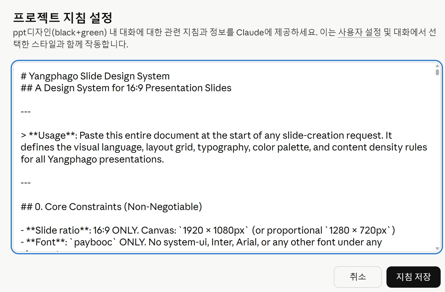
2-4. [Step 4] 최종단계_Claude 프로젝트 셋팅
완성된 프롬프트를 Claude 프로젝트의 지침(Instructions)에 넣어두면 끝.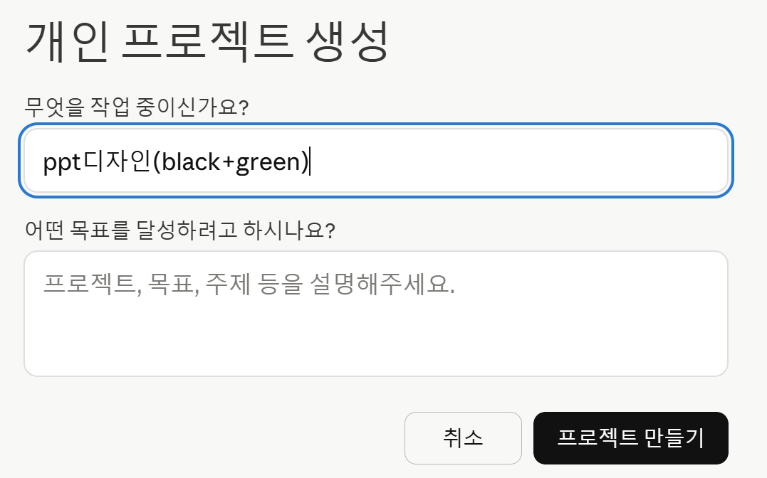
•
좌측 메뉴 → 프로젝트 → New Project
•
지침: 완성 프롬프트 입력
•
지식(Knowledge): 로고 파일, 참고 자료 업로드
•
이후 이 프로젝트에서 대화할 때마다 지침+지식이 자동 참조됨
2-5. [Step 5] 실제 사용 try
•
지식의 정리전돈을 보다 전문적인 Tool을 활용한뒤, 스타일에만 적용시키는 것이 보다 더 AI슬롭을 방지하는 지름길
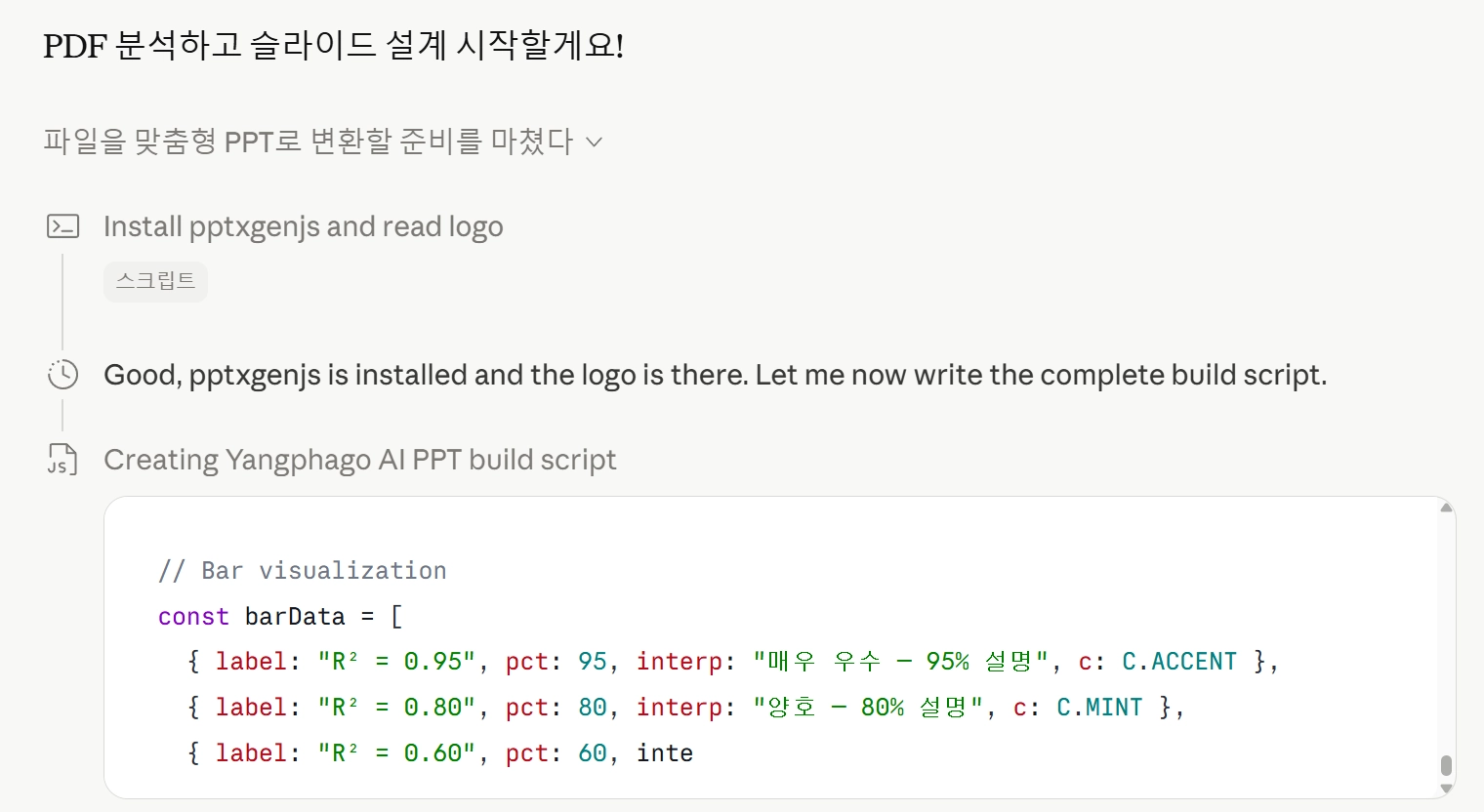
방법 A : 기존 파일 리디자인 (핵심 꿀팁 )
)내가 올린 파일을 우리 스타일의 PPT로 만들어 줘
Plain Text
복사

•
결과물
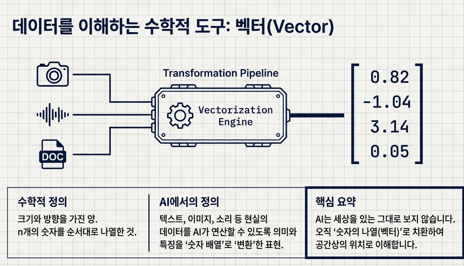
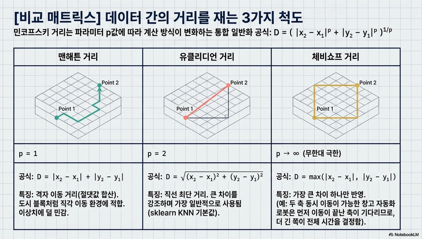
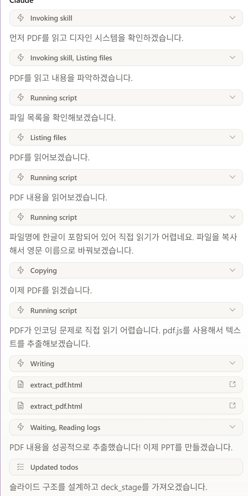
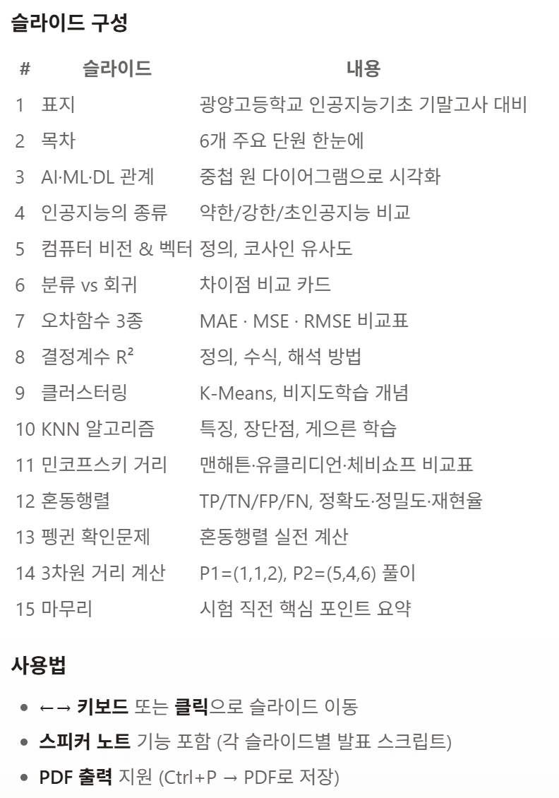
방법 B :노트북LM으로 1차 정선된 pdf활용(강추)
내가 올린 파일을 우리 스타일의 PPT로 만들어 줘
Plain Text
복사
•
기존에 퀄리티가 낮은 PPT, 또는 노트북LM에서 뽑은 PDF도 가능
•
비율·폰트·컬러·로고·위치·밀도·카피톤 — 설정대로 자동 변환
•
마무리 터치는 장당 약 1분이면 충분
3. 다양한 스타일 확보하기
3-1. 스타일 = 프로젝트
•
getdesign.md에서 스타일을 바꿔가며 프로젝트를 여러 개 만들 수 있음.
•
스타일 수만큼 프로젝트 생성 후 즐겨찾기에 고정해두면 작업 전환이 편함.
3-2. 양파고의 꿀팁
•
내가 기존에 만들었던 PPT중에 괜찮은 4~5개를 선택한 다음에
•
이걸로 나만의 시스템 프롬프트를 만들게 되면, 나의 취향이 200%반영된 PPT를 만들 수 있음
4. 단점
늘 그렇듯.. 클로드의 토큰은.. 해도해도 너무한다